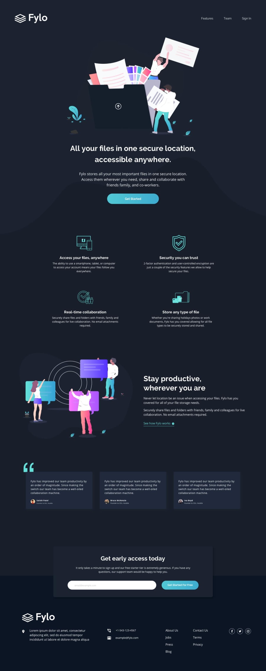
Fylo-dark-theme-landing-page built with HTML5 and Bootstrap4
Design comparison
Solution retrospective
Anyone who can help me to understand Media query? Thanks.
Community feedback
- @pikapikamartPosted over 3 years ago
Hello. Media query is the breakpoints. These are the sizes that when our viewport reached it, your code that is written in that query will take place. For example you made a
@media (max-width: 800px), when your viewport reaches the width of 800, then the code in there will run. But be aware thatmax-widthandmin-widthis different , you may get confuse. If you usemax-width, the code will run if and only if, your viewport reaches 800px, let's say we are resizing your desktop viewport then it reached themax-width, then it will run as long as the maximum width is 800px. Compare to themin-width, your code will run if and only if the minimum width of the viewport is 800 going up0
Please log in to post a comment
Log in with GitHubJoin our Discord community
Join thousands of Frontend Mentor community members taking the challenges, sharing resources, helping each other, and chatting about all things front-end!
Join our Discord
