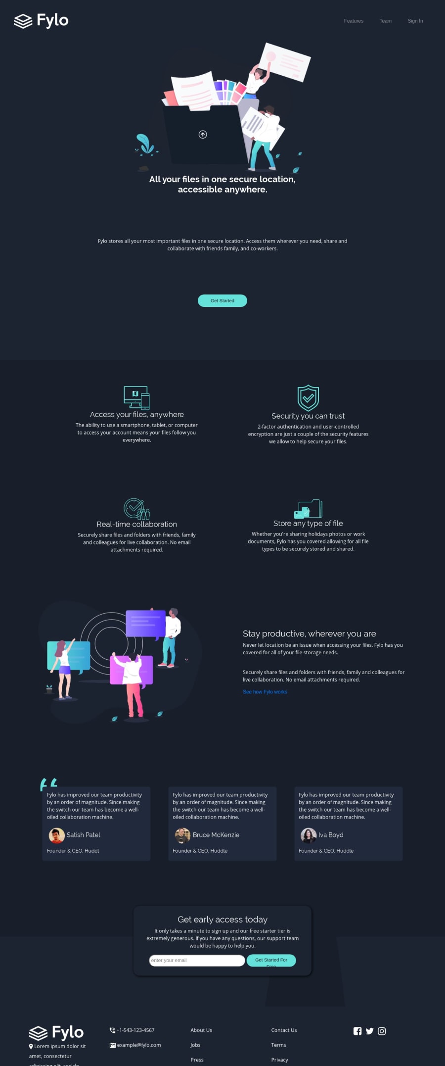


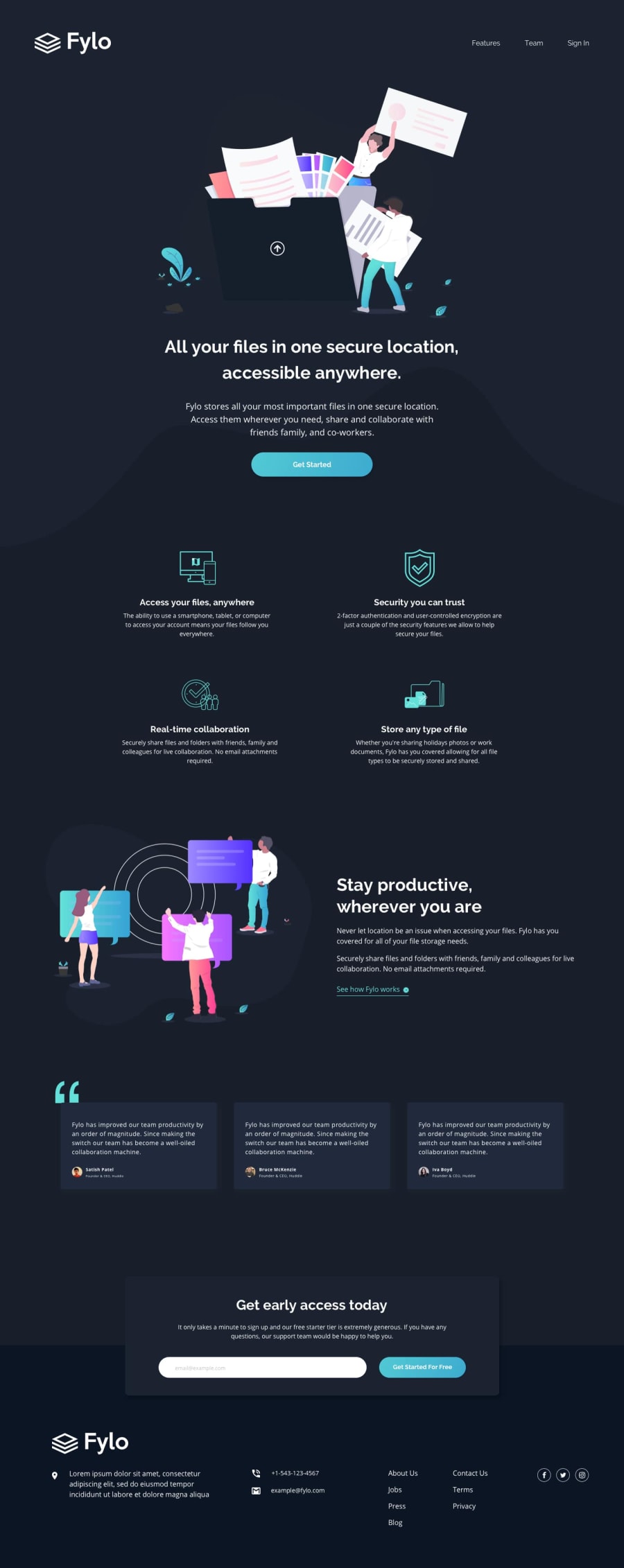
Design comparison
SolutionDesign
Solution retrospective
1)how can i change the curve section on going from desktop to mobile??
2)Anything mistake i did on this?and what should i focus on more?
3)rate it out of 10?
4)Any advice to make page like this more impressive?
5)How to check mobile view of website /is there any kind of emulator for that??
Community feedback
- @adarshcodesPosted over 4 years ago
Hi! @siddhantJH, great work👍
- In your curve-section add both the images, desktop as well as mobile. And make the opacity of the mobile image 0. Add when you want to apply the mobile image to the media query simply make its opacity to 1 and opacity 0 for the desktop image.
- No mistake but you can improve a few things, the bottom card's(get-access-body) shadows can be improved(try this
box-shadow: 2px 2px 20px rgba(0,0,0,.3);) use rgba color for the shadows so that you can add opacity also. And you can add your name in the attribution in the place of "Your name". You should focus on the code should be DRY and the design should look fine. One of the important things is your site should be responsive. - I don't think I can rate it(I'm not perfect😁). But definitely you can improve few things(in the get-access-body card like the input design and it needs some margin-bottom while checking responsiveness). You deserve more than 8.
- To make it more impressive? Try to add some animations and nice hover-effects.
- For the responsive view(including mobile), you can use the Chrome Developer tool(Press "CTRL+SHIFT+I" shortcut), and there you can find the responsive icon(a mobile with tablet).
2

Please log in to post a comment
Log in with GitHub
Join our Discord community
Join thousands of Frontend Mentor community members taking the challenges, sharing resources, helping each other, and chatting about all things front-end!
Join our Discord