Submitted over 3 years ago
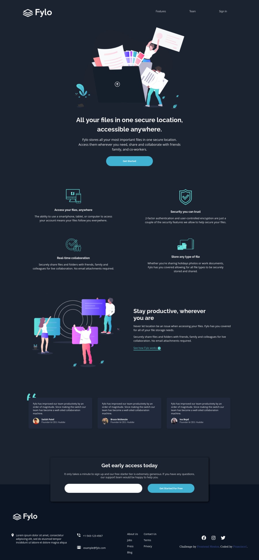
Fylo-Dark-Theme (HTML - CSS - SASS - FLEXBOX - GRID)
@Francisco-Git99
Design comparison
SolutionDesign
Solution retrospective
Hello, if you take the time to see the css code and the html structure to advise me on a better optimization, I would be very grateful, any constructive comments are more than welcome.
Hola, si se toman el tiempo de ver el codigo css y la estructura html para aconsejarme una mejor optimizacion estaria muy agradecido, cualquier comentario constructivo es más que bienvenido.
Community feedback
- @ChamuMutezvaPosted over 3 years ago
- the site needs to be improved for medium devices, the content used for mobile devices is stretching far to long up to 1365px
- wrap all content inside the
bodyelement with a div, the other purpose of this div is to set a max-width on it such that content on large screens do not stretch for as long as the screen is. If not controlled then content on large screens will be distorted. - a button and an
aelement should not be nested ,<div class="boton"><button><a href="#">Get Started</a></button></div>. Both are interactive elements. - headings should ascend in order without skipping headings.
- alt values must be very descriptive to assist users who rely on assistive technology to visualise the message being put across.
<img src="images/profile-1.jpg" alt="profile-1">, this is not descriptive enough. For decorative images , use empty alt values - footer anchor elements (about, jobs, press, blog etc)must be nested in an unordered list
Marked as helpful2
Please log in to post a comment
Log in with GitHubJoin our Discord community
Join thousands of Frontend Mentor community members taking the challenges, sharing resources, helping each other, and chatting about all things front-end!
Join our Discord
