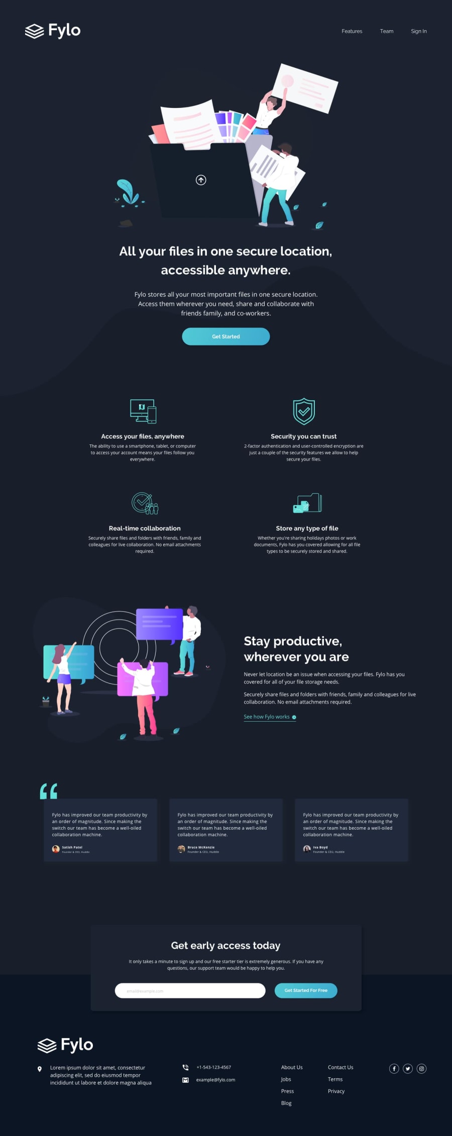
Design comparison
Solution retrospective
give feedbacks
Community feedback
- @BringsCodingPosted over 2 years ago
First of all, congratulations that you have set yourself a task and that you have finished it!
Looks good, but on mobile I see the following Distance between navbar and hero image is too big
The get start button has a border at the top when you press it, then only at the bottom
The distance from the cards to the upper section is too much
The cards are not centered At the very bottom the input field is unstyled
Otherwise everything looks good 👍
1@newwohhPosted over 2 years ago@BringsCoding hi thanks for the feedback, i just done it for fun and not much focused in styling i just simply finished it, but next time i will definitely put more attention to styling and try to do the exact in the design.
0
Please log in to post a comment
Log in with GitHubJoin our Discord community
Join thousands of Frontend Mentor community members taking the challenges, sharing resources, helping each other, and chatting about all things front-end!
Join our Discord
