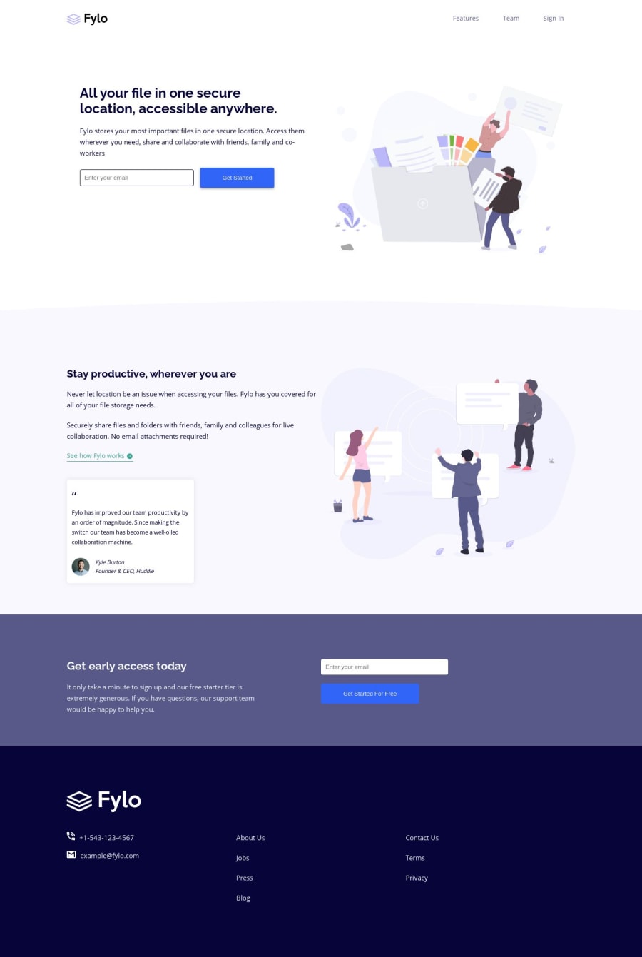
@mattstuddert
Posted
Hey Sebastien, nice work on this challenge! Your solution looks really good. As you can see by the design comparison above your overall layout looks great. The main thing would just be making general spacing and font-size
tweaks to get it to really match up to the design.
I'd recommend you try to resolve the errors in the report. At the moment, your input
elements are inaccessible to screen reader users. You img
elements are also missing alt
attributes which are also important for accessibility.
Your Sass code looks great, especially for your first time using it. Did you enjoy working with Sass? I find it reduces the amount of code you write quite a bit and makes it so much more manageable!
Have you ever tried using min-width
media queries instead of max-width
? It's quite a common workflow with front-end developers to use them and work mobile-first. It can often lead to less CSS code and has the benefit of loading in fewer styles for mobile users, which can be a nice performance gain. I'd recommend trying it on a future project to see how you like it.
I hope that helps! Let me know if you've got any other questions π
@Sebystien
Posted
@mattstuddert Hi Matt, Thank you for taking the time to reply. Note taken! I will go over the codes again...I was struggling with mobile first approach, but will watch a couple of youtube vids just so I can use in my next project.
And I do think Sass is easier to use than regular css :) it reduces the amount of work.
Thanks again for the feedback!
@mattstuddert
Posted
@Sebystien you're welcome! Mobile-first can be tough to get started with. But a lot of developers actually find it a faster workflow once they're used to it. I definitely did!
@Sebystien
Posted
@mattstuddert Hi Matt - took your advice and i started digging into mobile first approach. it's a LOT less painful and saved me lots of time!! Thanks a lot
@mattstuddert
Posted
@Sebystien no problem! Itβs great to hear that mobile-first is working well for you!