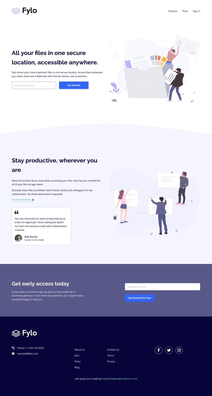
Fylo Two Columns Layout Landing Page HTML5 CSS3 Sass Mailgo
Design comparison
Solution retrospective
Hello Everyone! 👋
I was doing this challenge on my Android phone. Hopefully, it looks good on your deskop. 😅
Questions:
- I used
aria-labelledby
on everysection
. However, I'm not sure that it is a good thing to do. So, what do you think about it? - If you have a solid understanding of SEO and believe there is something wrong with it, please tell me about it.
- Is this website has a good accessibility? Especially for screen reader, since I only tested the site using TalkBack.
Of course, any feedback is appreciated!
That's it! Happy coding everyone!
Community feedback
- @grace-snowPosted over 3 years ago
Yeah Dave’s explanation is spot on. Sections actually aren’t announced by most screenreaders, but on a page like this that doesn’t matter because screenreader users rely on headings for navigation. Having headings in a good order is the most important thing.
You do need to change some bits on your forms though.
- aria describedby should not include the label as well as the error
- error messages shouldn’t appear as soon as you focus on an input. Change that to be on blur and it would be a much better experience
- Don’t change button labels with aria if there is already label text there
Remember that aria-label is a last resort. It isn’t fully translatable and aria-labelledby, sr-only text or any html text will almost always be preferable
I hope that makes sense
Marked as helpful2@grace-snowPosted over 3 years agoOne more thing. I recommend removing this
<h3 class="sr-only" id="testimonialTitle"> Don't just believe on what we say, it has been proven by ten of thousands people. Here is a review from CEO of Huddle. </h3>
This wouldn’t be a h3, it’s a paragraph. And if it is valuable content it would be on the page already.
Try not to overthink accessibility. It seems like you are throwing a bit much at this and it could actually make the page harder to interact with in some ways
1@vanzasetiaPosted over 3 years ago@grace-snow Thanks Grace for your feedback!
Yeah, I was thinking too much about accessibility 😅. I will make the changes as soon as possible.
0 - @dwhensonPosted over 3 years ago
Me again! I just saw you asked a few questions here and didn't get a response.
Regarding your first question, my understanding is that this is necessary if you want to expose the section as a landmark on the page (i.e. equal in importance in the as the header, footer and navigation etc) otherwise it's not needed - especially if you have a good heading structure - tagging @grace-snow here to see if she can confirm or correct me here...
Cheers Dave
Marked as helpful1@vanzasetiaPosted over 3 years ago@dwhenson Thanks Dave for trying to answer my question! The idea of putting
aria-labelledby
was coming from this W3 - WAI ARIA | Region Landmark site.0@dwhensonPosted over 3 years ago@vanzasetia yes, I think this is the key bit from that page, that a landmark should 'contain content that is ... sufficiently important that users will likely want to be able to navigate to the section easily and to have it listed in a summary of the page."
So if it's an important section add aria-labelled by and if it's not we can leave it out? I guess...
0
Please log in to post a comment
Log in with GitHubJoin our Discord community
Join thousands of Frontend Mentor community members taking the challenges, sharing resources, helping each other, and chatting about all things front-end!
Join our Discord