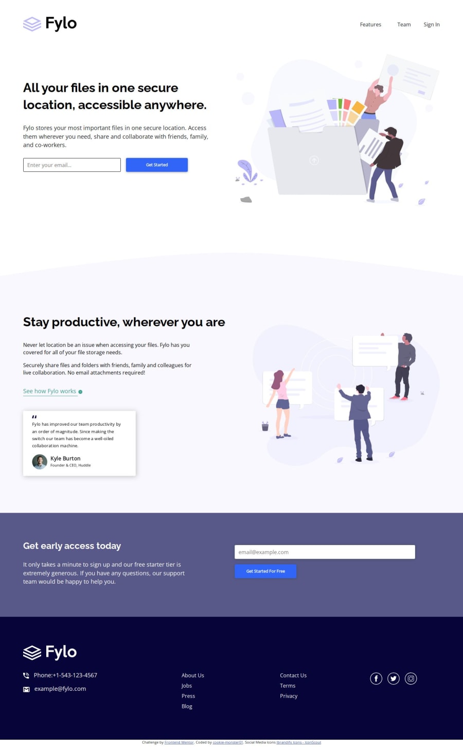
Fylo: Two column layout using grid and flexbox.


Design comparison

Solution retrospective
- I learned grid and tried to implement it in this project along with flexbox and media-queries.
- Tried to use a little bit of bootstrap.
- Practiced min(), calc() and clamp().
Creating blockquote was really challenging. I tried using flexbox, learned about flow-root, implemented both. Tried to use float, but the credentials and CEO image did not align as expected, so applied absolute positioning on the CEO Name and his credentials.
What specific areas of your project would you like help with?Can someone help me with:
-
how to add custom message alert on email input. I haven't learnt sass variables yet, I saw I read about it, but haven't deep-dived into it, can we do the message alert without it?
-
how to change the fill color of svg icons on hover.
Community feedback
- @grace-snowPosted 5 months ago
Before anything else, this has foundational HTML issues that need addressing. It's really important to use these challenges to stretch your skills in translating a design into meaningful and appropriate html.
- there's no need for that container div around everything. You shouldn't ever be styling on IDs anyway, and could put those styles on the body if you wanted, but they aren't necessary to have at all unless you really want them for some reason.
- the logo isn't a nav item so should really be inside the header and outside the nav. There's no reason to wrap it in an extra div either. Extra complexity for no benefit.
- Look up how and when to write alt text on images. There are some great posts about this in the resources channel on discord. Alt is not code. It is content. The logo alt should say the name of the brand / same as the logo says.
- the list of links in the nav probably doesn't need wrapping in an extra div either. Not a problem but check these extra wrappers you're adding are actually necessary.
- The nav in this is very simple. It will need a flex wrap so that it can wrap onto a new line when it needs to.
- the nav has no links in it! So how is that going to work?!
- inputs must always have a label.
- inputs that collect personal information like email must also have an autocomplete attribute.
- background images are decorative so alt must be empty.
- same with quote marks
- the blockquote image, name and role do not belong inside the blockquote. They are just paragraphs or you can put all that info in a figcaption and place both the blockquote and figcaption inside a figure element.
- in the footer you can treat the phone and email icons as decorative OR give them alt that says what they are. Eg "Phone:". They shouldn't say icon or be hyphenated strings.
- id expect the phone and email to be links.
- I'd expect the list of links in the footer to be in a nav, to use links (!) and to all be in one list not two.
- once two navs are on the page, they will each need an aria-label. Eg "main/primary/header" on the first nav and "footer/secondary" on the second.
- the social icons should be inside links (again). They need accessible names too. You can use the img alt for that eg "Facebook" or you can add sr-only text inside the links, or you can add aria-labels on the links.
- the attribution should be in a separate footer element underneath the first. Then each footer needs an aria-label. Eg "Fylo" and "attribution".
- you don't need bootstrap in this. Remove it.
And css issues
- the clamped font sizes make this inaccessible at the moment. You must convert viewport values to rem for that central value. Look up how it's done on the Utopia responsive sizing site for an example.
- I don't think you want to be using percentages for margins. You lose all control that way. You are more likely to want other units depending on where you're using it. Eg inline padding is often px or a min() function with px and viewport width units. Margin-top on prose elements like paragraphs or headings in a blog is often in em units so it scales with that element's font size. In other places margin may be auto and padding/margin may be rem when you want it to scale with the base font size. You will develop instincts and preferences for these things over time. The key thing is to test a lot, zoom, resize the viewport, change orientation and change text size settings so you learn the consequences of each decision. Check that alignment stays the same on the left and right as you scroll down. Be systematic.
- make the nav list flex! Don't mess with margins on each child. That's so much more complicated and less robust.
- don't set row height on
.file. You don't need all of that tbh. Use fr units with grid. You're making this very complicated at the moment, adding lots of unnecessary properties. Remove as much as you can. Remember you can create a Sublayout element. And then nest inside it a flex or another grid element as a child of that Sublayout if you need to. - you shouldn't be setting width on the button. It's either width 100% or has padding. Occasionally you will need a min-width on a button but that's rare.
- the button should not have a height either. Padding and content creates the height.
- don't mix decimals and fr units. 0.5fr should be 1 fr. Then adjust the other value as appropriate like 1fr would become 2fr. You'd never mix fractions and decimals in maths so don't do it in css.
- stop using all these very complex css selectors. Stick to single class selectors as much as possible.
I'm out of time to leave more feedback. This shows why it's so important to get feedback on small challenges first and build up learnings progressively.
Marked as helpful0P@cookie-monster01Posted 5 months ago@grace-snow thank you so much for this, I was looking for a feedback like this. I started learning html and css since August, I'm really enjoying it. I just wanted to see how much I understood and hence I excitedly jumped onto the junior projects. I also thought I was possibly over complicating things, I have sort of understood the concepts of how things work in general but not really how, when and where to apply them. I will look into all of this before jumping onto another project. Thank you so much once again.
Could I please add you on discord? Its easier to request a feedback directly, and I will try my best to not bother you too much. But your feedbacks would be super helpful for me to improve.
0 - P@Islandstone89Posted 5 months ago
Hi!
To change the fill color of an icon, it must be an inline SVG, and not a
<img>. Copy the SVG code (it should show when you click on the icon in VS Code) and place it in the HTML.Let's say you give each icon a class:
<svg class="social-media-icon">. To change thefillyou need to target the<path>element inside of the SVG:.social-media-icon path:hover { fill: hsl(240, 75%, 75%); }The issue with this is that the fill only changes when you hover exactly over the icons, which are not super big. To make it easier, I would change the fill when you hover over the SVG itself:
.social-media-icon:hover path {
  fill: hsl(240, 75%, 75%);
}
You could also nest the selector:
.social-media-icon:hover  {
  path {
     fill: hsl(240, 75%, 75%);
  }
}
The email validation is a bit more tricky to explain here - if you want, you can add me on Discord, my username is islandstone :)
Marked as helpful0P@cookie-monster01Posted 5 months agoHey Øystein, thank you so much for your reply. I have sent you a request on discord but I'm unable to send you a DM. I would be super grateful if you could help me understand the custom email validation, and if its not too much to ask, could you also please guide me on how I could improve my code both html and css ? I'm very new to web-development, I started learning it since this year, August and I'm happy to receive any feedback or suggestions i can get to improve.
1P@Islandstone89Posted 5 months ago@cookie-monster01 Added you as a friend on Discord :)
1


Please log in to post a comment
Log in with GitHub
Join our Discord community
Join thousands of Frontend Mentor community members taking the challenges, sharing resources, helping each other, and chatting about all things front-end!
Join our Discord