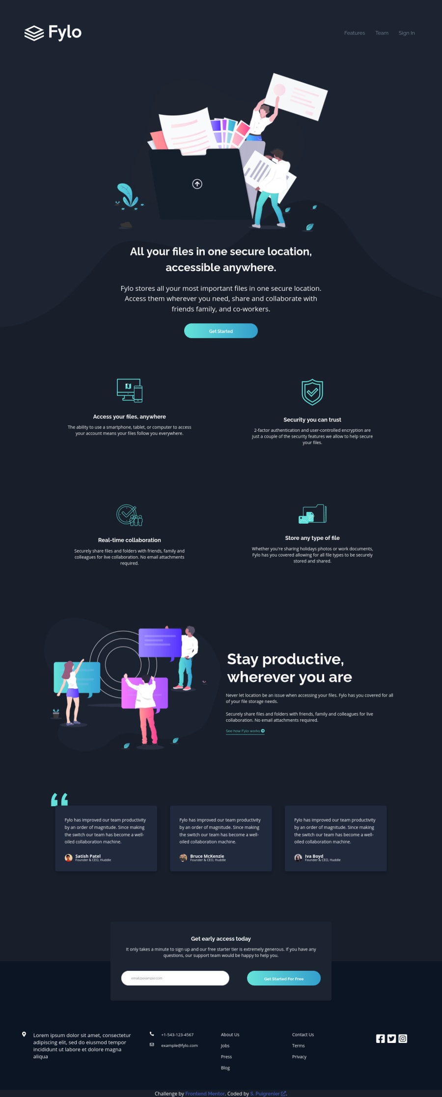
Design comparison
Solution retrospective
Managing the curvy background was not easy and I am not fully happy with the result concerning the way it moves depending of the size of the screen...
Community feedback
- @jlpastoPosted about 3 years ago
Hi, Nice solution. Almost there! I recommend putting the JPEG files to Adobe XD or Figma so we can measure the length of the design. Replicating the design perfectly is difficult so I personally use the above solution in measuring elements and getting the end-result close to design as possible.
Marked as helpful0@sebastienpuigrenierPosted about 3 years ago@jlpasto I re-uploaded update htm and css as it seems that my git doesn't have the last version of my work. It looks better now but my goal was not the pixel perfect but good responsive layouts ;) Thanks for your comment.
0
Please log in to post a comment
Log in with GitHubJoin our Discord community
Join thousands of Frontend Mentor community members taking the challenges, sharing resources, helping each other, and chatting about all things front-end!
Join our Discord