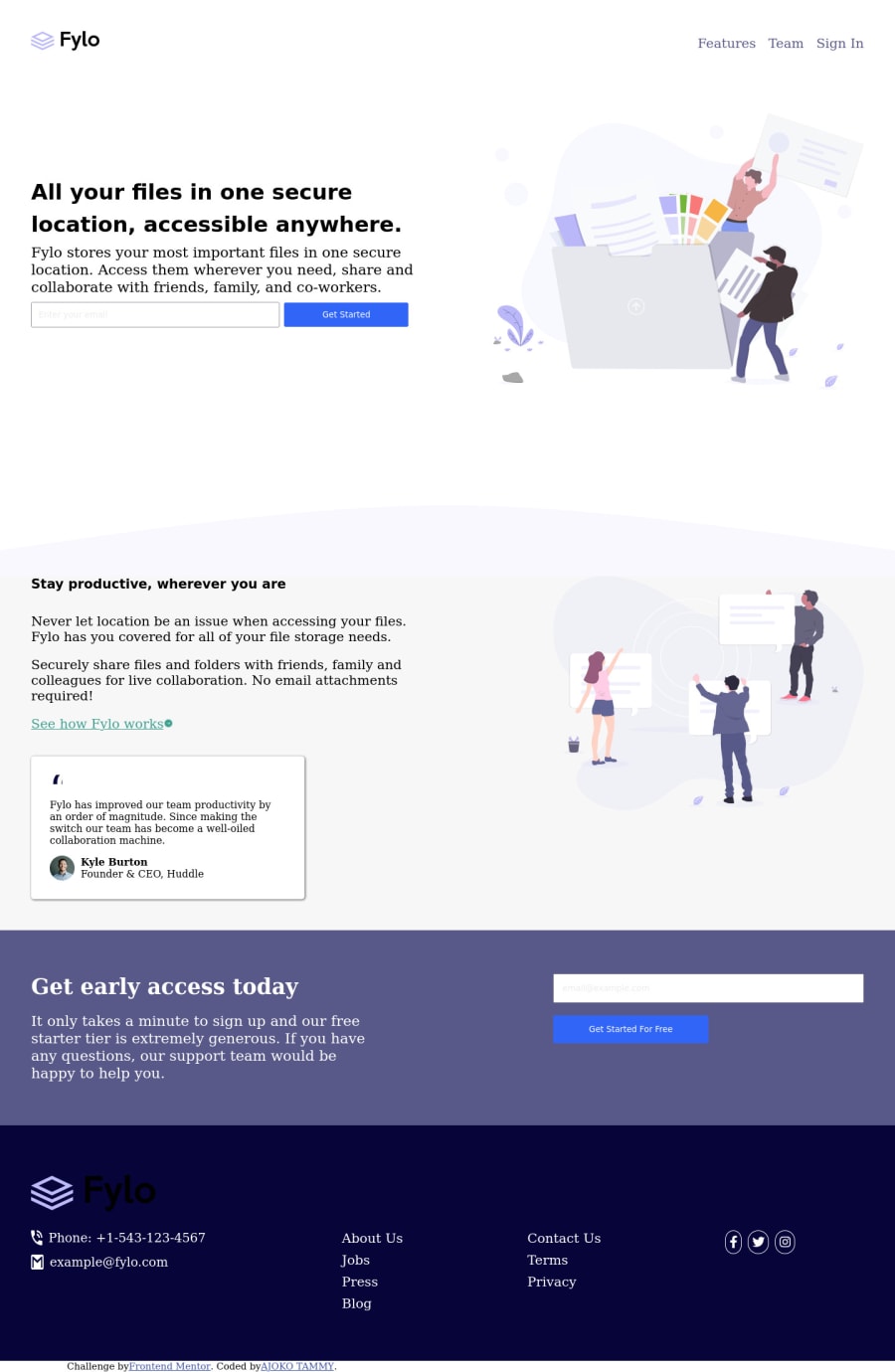
Design comparison
Solution retrospective
- I'm learning how to use media queries to make my site also look well on mobile view.
- I noticed when I viewed my site on my mobile phone all the gap I put in the code was gone. why this is so I don't know, or I shouldn't make use of gap anymore. Any suggestion on any part of the code is very welcome.
Community feedback
- @PhoenixDev22Posted over 2 years ago
Hello Tammy,
Congratulation on completing another frontend mentor challenge.
Excellent work! I see you have received some incredible feedback. I have some more suggestions if you don't mind:
HTML
- Images must have alt attribute. The logo's alternate text is needed on this image . You can use the website's name as an alternate text. You may set
alt=”Fylo"
. If you are going to leave the logo not wrapped by<a>
, it’s better to place it out the<nav>
as it does not navigate the user in anywhere(only an image)
- In
class="navbar">
, Put your links within an unordered list structure so that a screen reader will read out how many things are in the list to give visually impaired users the most information possible about the contents of the navigation.
- Wrap your sections within
<main>
landmark.
- look up a bit more about how and when to write alt text on images. Learn the differences with decorative/meaningless images vs important content. For decorative images, you set an empty
alt
to it with anaria-hidden=”true”
to remove that element from the accessibility tree. This can improve the experience for assistive technology users by hiding purely decorative images.
- Forms with proper inputs and labels are much easier for people to use. To pair the label and input, one way is an explicit label’s
for
attribute value must match its input’sid
value. Input fields without accompanying labels can lead to accessibility issues for those who rely on screen readers. If a screen reader comes across an input field without a label it will try to find some accompanying text to use as the label. (To hide the label visually but present for assistive technology, you may usesr-only
class )
- For the alternate text of the avatar testimonial should not be ** avatar-testimonial** . You can use the avatar’s name
alt=" kyle burton"
. Also consider that the alternate text should not be hyphenated , it should be human readable
- For the testimonial , you may use
<blockquote>, <figure>, <figcaption>
-
Use the
<nav >
landmark to wrap the footer navigation witharia-label=”secondary “
oraria-label=”footer”
. A brief description of the purpose of the navigation, omitting the term "navigation", as the screen reader will read both the role and the contents of the label. Thenav
element in the header could use anaria-label="primary"
oraria-label=”main”
attribute on it. The reason for this is that, you should add thearia-label
for a nav element if you are using the nav more than once on the page.you can read more in MDN -
You may use the
<address>
tag to wrap the contact informationclass="sets1"
for the author/owner of a document or an article (email and phone number.)
- If your icons are purely decorative, you'll need to manually add an aria-hidden attribute to each of your icons.
- The social links wrapping the icons must have
aria-label
orsr-only
text indicate where the link will take the user. . Then you setaria-hidden =”true”
to the icons to be ignored by assistive technology . It might look like this:
<ul class=”....” > <li><a href=”#” aria-label="Visit our facebook"> <i class="fa-brands fa-facebook " aria-hidden=”true”></i></a></li> <li><a href=”#” aria-label="Visit our twitter"> <i class="fa-brands fa-square-twitter" aria-hidden=”true”></i></a></li> <li><a href=”#” aria-label="Visit our instagram"> > <i class="fa-brands fa-square-instagram" aria-hidden=”true”></i></a></li> </li> </ul>
Aside these , you did great work. Hopefully this feedback helps.
0 - Images must have alt attribute. The logo's alternate text is needed on this image . You can use the website's name as an alternate text. You may set
- @shivaprakash-sudoPosted over 2 years ago
Hello Tammy,
I have few things to say:
- Try to put the CSS in a separate file, instead of putting inside the html file.
- It's better to create new repository for a new project, instead of having all the projects in one repository. Having own repository for a particular project is easy to handle and maintain.
- Regarding the website, it only changes the layouts when the screen width is below
375px
. This is becausemax-width
property was used instead ofmin-width
in the media query. The width properties given in the design are just for reference, you don't need to code particularly for those widths. - Try to code for mobile screens first and then change the layouts accordingly for bigger screens using
min-width
property in media queries. For example, have one kind of layout until 600px (mobile screens) and then usemin-width: 600px
(tablet screens) property to change layout for screens starting with width 600px. For even bigger screens, you can use min-width of 1000 or 1100px. Try not to put too many media queries. - Finally try to wrap the main content of the site inside body in a
main
tag.
Happy coding!
0 - @DavidMorgadePosted over 2 years ago
Hello man congrats on finishing the challenge!
To answer your question, I think the problem is that you are not using correctly your media queries correctly, your
gap
property is inside a(max-width: 375px)
media query, this means that it will only apply those styles from 0 to 375px, there is no mobile device that is actually less than 375px (I think Iphone SE 2020 has the smallest screen with 375px).To fix this you can use your media querys as
(min-width: 375px)
or(max-width: 768px)
768px is the standart size for tablets, I would also recommend you to use the min-width approach, you can use the max-width if you want, but don't use both at the same time in a project because it can become a mess!Hope my feedback helped you, if you have any questions don't hesitate to ask!
0
Please log in to post a comment
Log in with GitHubJoin our Discord community
Join thousands of Frontend Mentor community members taking the challenges, sharing resources, helping each other, and chatting about all things front-end!
Join our Discord