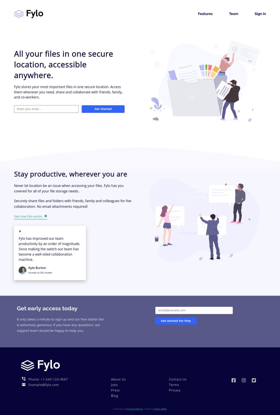
Design comparison
SolutionDesign
Solution retrospective
Hi coders, This is my first try using SCSS, any feedbacks would be appreciated.
Community feedback
- @vanzasetiaPosted over 3 years ago
👋Hi Rabah!
I have some feedback on this solution:
- The nav links should have a very dark blue color.
- Try to add simple form validation using
:invalid. - The
contentshould be on its own section, not within the header. - The footer logo should be white. You can have a white logo by opening the
logo.svgand copy everything. Then you create a new filelogo-white.svgand paste in. Lastly you can change all thefill="#fff". - The
All your files...should beh1. - For the logo image, the alt attribute should contain the company name
Fylonot the logo word.
That's it! Hopefully this is helpful!
Marked as helpful1@rabahmilanoPosted over 3 years ago@vanzasetia Thank you very much for your time Vanza ! Your feedbacks was very helpful, I fixed some design issues, but I steel some difficulties in the organization of the SCSS files since it is my first try with this preprocessor.
0@vanzasetiaPosted over 3 years ago@rabahmilano You can try the 7 - 1 Pattern to help organize Sass files. Here is a Sass Guidelines that will explain 7 - 1 Pattern and other good practice when writing Sass.
1
Please log in to post a comment
Log in with GitHubJoin our Discord community
Join thousands of Frontend Mentor community members taking the challenges, sharing resources, helping each other, and chatting about all things front-end!
Join our Discord
