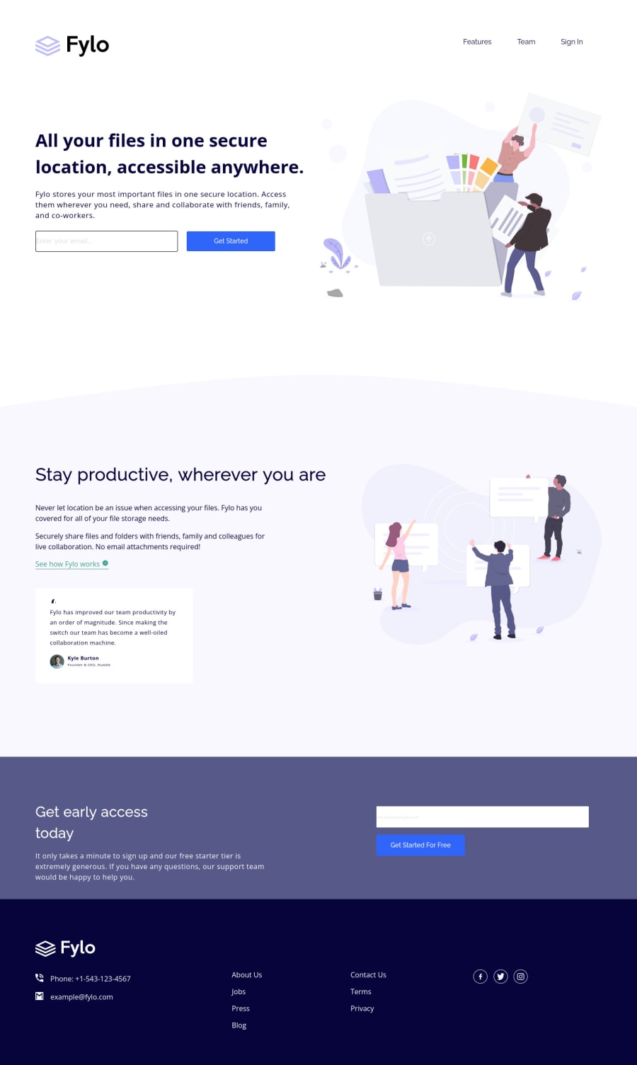
Design comparison
Solution retrospective
I didn't work on making the solution responsive - I purely worked on getting the design right for the two provided breakpoints: 375px and 1440px.
Any feedback is greatly appreciated.
Please log in to post a comment
Log in with GitHubCommunity feedback
- @K4UNG
Hey! Congrats on completing the challenge. Making the website look good for only two very specific screen widths is not a good approach I'd say. It means your site's gonna break if the user changed the screen width even by a pixel or so. After all, landing pages like these are best to practice responsive designs so why waste the chance. I suggest you learn it first if you're not comfortable yet, then utilize these kinds of challenges to practice it. https://www.w3schools.com/html/html_responsive.asp Here's a good tutorial to get you started, or if you're not a reading person, I recommend checking out Kevin Powell's Youtube channel. Happy Coding!
Join our Discord community
Join thousands of Frontend Mentor community members taking the challenges, sharing resources, helping each other, and chatting about all things front-end!
Join our Discord
