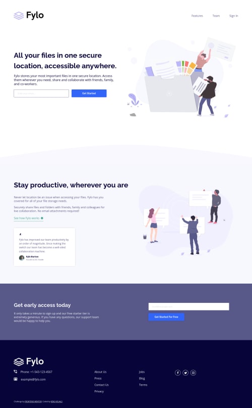
Submitted almost 4 years agoA solution to the Fylo landing page with two column layout challenge
Fylo Landing Page with Vanilla JS, SCSS, and BEM
accessibility, sass/scss, bem
@kens-visuals

Solution retrospective
This project brought me closer to the end of the JUNIOR level. There's only one project left and a couple of days till the end of the year. Which means that I'm so very close to achieving my goal of finishing every challenge in this JUNIOR level. Not a lot to say about this project, the only challenge I had was the pattern image, but it wasn't much of a challenge at the end of the day. One more challenge and I can call it a year!
If you have any suggestions, feel free to leave them in the comments' section 👨🏻💻 Cheers 👾
Code
Loading...
Please log in to post a comment
Log in with GitHubCommunity feedback
No feedback yet. Be the first to give feedback on Ken's solution.
Join our Discord community
Join thousands of Frontend Mentor community members taking the challenges, sharing resources, helping each other, and chatting about all things front-end!
Join our Discord