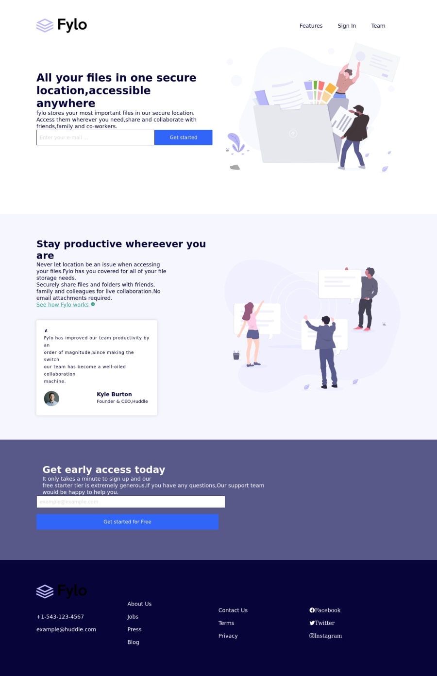
Fylo landing page with two columns layouts.
Design comparison
Solution retrospective
I am unsure of the mediaquery of phone own.
Community feedback
- @PhoenixDev22Posted over 2 years ago
Hello Olaniyi Victor,
Great work!Congratulation on completing this challenge.I have some suggestions regarding your solution:
HTML
-
Document doesn't have a
<title>
element. -
<html>
element does not have a[lang]
attribute. -
Heading elements are not in a sequentially-descending order. For example: * For example, in
class="light-blueish"
using an<h2>
element for your section title and then using<h4>
element for the avatar’s name, that will cause the audit to fail because the <h3> level is skipped:*To fix that , make all heading elements follow a logical, numerical order that reflects the structure of your content. -
Use the website's name as an alternate text. it may set alt=”Fylo logo".If you are going to leave the logo not wrapped by
<a>
, it’s better to place out the<nav>
as it does not navigate the user in anywhere(only an image) -
Forms with proper inputs and labels are much easier for people to use. To pair the label and input, one way is An explicit label’s
for
attribute value must match its input’sid
value. Input fields without accompanying labels can lead to accessibility issues for those who rely on screen readers. If a screen reader comes across an input field without a label it will try to find some accompanying text to use as the label. (To hide the label visually but present for assistive technology, you may usesr-only
class ) -
look up a bit more about how and when to write alt text on images. Learn the differences with decorative/meaningless images vs important content like
icon-phone, icon-arrow , icon-quotesand
icon-email` are decorative. For decorative images, you set an emptyalt
to it with anaria-hidden=”true”
to remove that element from the accessibility tree. This can improve the experience for assistive technology users by hiding purely decorative images. -
For the alternate text of the testimonials avatar should not be
user
. It’s meaningless, you can use the avatar namealt=" kyle burton"
. -
Use the
<nav >
landmark to wrap the footer navigation witharia-label=”secondary “
oraria-label=”footer”
. A brief description of the purpose of the navigation, omitting the term "navigation", as the screen reader will read both the role and the contents of the label. Thenav
element in the header could use anaria-label="primary"
oraria-label=”main”
attribute on it. The reason for this is that, You should add thearia-label
for a nav element if you are using the nav more than once on the pag..you can read more in MDN -
For the testimonial , you may use
<blockquote>, <figure>, <figcaption>
. -
The social links wrapping the icons must have
aria-label
orsr-only
text indicate where the link will take the user. Then you setaria-hidden =”true”
to the icons to be ignored by assistive technology. -
You may use the
<address>
tag to wrap the contact information for the author/owner of a document or an article (email and phone number.) -
You have used
<br>
, using<br>
is not only bad practice, it is problematic for people who navigate with the aid of screen reading technology. Screen readers may announce the presence of the element. This can be a confusing and frustrating experience for the person using the screen reader. You can read more in MDN -
Do not use
<br>
to create margins between paragraphs, wrap them in<p>
elements and use theCSS margin
property to control their size.
Aside these , great work . Hopefully this feedback helps.
0 -
- @EmmanuelOlokePosted over 2 years ago
Hello Victor, great job completing this challenge, keep up the good work.
There are a few observations I've made while going through the preview site though. I think the mobile responsiveness can be improved upon. Elements on the page can be better positioned to align more with the mobile design file provided in the challenge. I think using appropriate @media queries can take care of this problem, the right spacing and positioning should do it.
Also in the first section of the page, the Get Started button and input field could use some spacing and margins.
In addition, in the Get early access section, the text and form are supposed to be displayed side by side on the desktop view as opposed to the current arrangement.
Finally, I think the colour of the Fylo logo in the Footer section should be changed to white, to improve the contrast, the current colour is really difficult to see at the moment.
Once again, good job on completing the challenge. Enjoy the rest of your week.
0
Please log in to post a comment
Log in with GitHubJoin our Discord community
Join thousands of Frontend Mentor community members taking the challenges, sharing resources, helping each other, and chatting about all things front-end!
Join our Discord