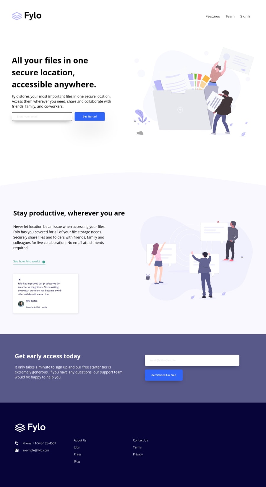
Design comparison
Solution retrospective
Hello, Frontend Mentor community. This is my challenge for the 'Fylo Landing Page With Two Columns Layout."
Since they weren't provided with the challenge I made my own social icons. However, I couldn't figure out how to do their hover effect. I also couldn't make the "check your email message" on the inputs. Lastly, I also couldn't figure out how to do hover on the green <a> tag since it's supposed also to cover the arrow icon.
I'd be happy to get so feedback and tips on getting those working properly, so I can learn and update the code.
Community feedback
- @blahkingPosted about 2 years ago
Hello, there are some tips for you.
Hover on the green <a>: You can use pseudo-elements "::after" + position to set the line instead of using border-bottom.
a.how-it-works { position: relative; } a.how-it-works:hover::after { position: absolute; left: 0; right: 0; bottom: 0; height: 1px; background: green; }
Hover on the icons: You made these icons by yourself ? Amazing, that's so cool! But you used error image name so they didn't display, you should use "Facebook.svg" in html instead of "Facebook.webp". Maybe you can try "Font Awesome" for social icons, it's easy to change icons color on hover.
Your page has horizontal scrollbar, it's not good for a web page. Delete body {width: 100vw} will work fine. Thank you, I also learned something. stackoverflow
I see many width: 100% in your code. Many of them are not needed. For a block element, for example, div's default width is 100%of it's parent element. Normal Flow
Hope it helps you.
Marked as helpful0@PeteonthebeatPosted about 2 years agoHey @blahking, Thank you so much for the thorough feedback. I’ll definitely implement all of it asap updating the code.
As long as for the svg/webp thing, I basically experimented with both to see if I could get the hover effect to be on point, but I forgot to change HTML.
I didn’t use font awesome icons because, I didn’t find ones to look identical to those on the design files.
Regards!
0@blahkingPosted about 2 years agoHi@Peteonthebeat, you can use a div or something to contain the fontawesome icon, and then make the container to be a circle, then it looks same with the design.
Marked as helpful0
Please log in to post a comment
Log in with GitHubJoin our Discord community
Join thousands of Frontend Mentor community members taking the challenges, sharing resources, helping each other, and chatting about all things front-end!
Join our Discord