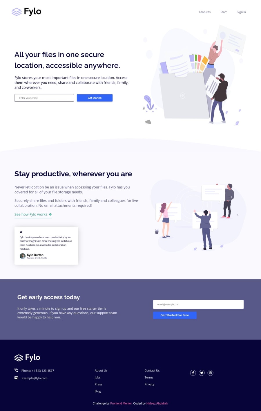
Design comparison
Solution retrospective
This is one project that I started more than a year ago but I got burnt out and abandoned all web development projects. I recently decided to continue the projects and thank goodness, I continued as this particular project taught me a lot.
All criticisms and suggestions are welcomed.
Community feedback
- @0xabdulkhaliqPosted over 1 year ago
Hello there 👋. Congratulations on successfully completing the challenge! 🎉
- I have other recommendations regarding your code that I believe will be of great interest to you.
ANCHOR ELEMENT 🔴:
- The
<a>
elements lacksaria-describedby
attribute which is way more important for social links in an<a>
tag can help provide more context to users with visual impairments who use assistive technologies such as screen readers to access your website.
- When a screen reader encounters an anchor tag with a social link, it may announce the link's text content, such as "Facebook" or "Twitter," by including an
aria-describedby
attribute that points to a nearby element containing a description of the link's purpose, you can provide more context and clarity to the user.
- By providing this additional information, you can help users with visual impairments to better understand the purpose and value of social links, and encourage them to engage with your content. This can ultimately improve the user experience on your website, and make it more accessible and inclusive for all users.
- Example:
<a href="#" aria-label="Facebook profile of Huddle"> <img src="./images/facebook.webp" alt=""> </a>
- And you don't want to add visually hidden
span
elements,aria-label
is enough to go with accessibility
- If you have any questions or need further clarification, you can always check out
my submission
and/or feel free to reach out to me.
.
I hope you find this helpful 😄 Above all, the solution you submitted is great !
Happy coding!
Marked as helpful0@elfreezePosted over 1 year ago@0xAbdulKhalid thanks so much for your suggestions. I've been trying to find ways to address the issues pointed out in the accessibility report but definitely helped me address them. I've implemented all of your suggestions and everything worked as expected.
Thanks once again.
0 - @vanzasetiaPosted over 1 year ago
Hi, Hafeez Abdallah! 👋
Great for you to finally complete the project. I hope that you were having when continue building the project. 🙂
Here are some suggestions for improvements.
- Remove
role="banner"
from<header role="banner">
. The<header>
element has already an implicitrole="banner"
. So you do not need to add therole
attribute when you are using<header>
. - For images containing text, make sure the alternative text includes the image's text. In this case, the Fylo logo should have an
alt
value of “Fylo”. Reference: Checklist - The A11Y Project #for-images-containing-text-make-sure-the-alt-description-includes-the-images-text - Alternative text for images should not include any words that are related to the word "image". The semantic meaning of the
<img>
element tells assistive technologies to pronounce it as an image. <img>
elements must havealt
attributes. For decorative images, leave thealt
attribute empty—do not remove it.- Every
<input>
must have a label or an accessible name. I recommend usingaria-label
to label the<input type="email" name="email" id="email" placeholder="Enter your email.">
. <button>
element must always havetype
attribute to prevent unexpected behavior. Source: Checklist - The A11Y Project #use-the-button-element-for-buttons- "Get early access today" should be
<h2>
. - "Kyle Burton" should not be a heading.
- Learn how to use heading tags — How-to: Accessible heading structure - The A11Y Project
- You do not need to have
id
for the social media links. - Don't use
id
selectors for styling. There are two reasons for not using ID’s to style content:- They mess up specificity because they are too high (the most important reason).
- They are unique identifiers. So, they are not reusable on the same page.
- Learn more — What the ID attribute is REALLY for
- Never use
px
unit for font sizes. Userem
orem
instead. Relative units such asrem
andem
can adapt when the users change the browser's font size setting. Learn more — Why you should never use px to set font-size in CSS
You can improve the site at your own pace—no rush. Don't feel overwhelmed. 🙂
I hope this helps. Happy coding! 😄
Marked as helpful0@elfreezePosted over 1 year ago@vanzasetia thanks for your suggestions. I've implemented some of them. I'll do the remaining in the near future.
Thanks once again.
0 - Remove
Please log in to post a comment
Log in with GitHubJoin our Discord community
Join thousands of Frontend Mentor community members taking the challenges, sharing resources, helping each other, and chatting about all things front-end!
Join our Discord