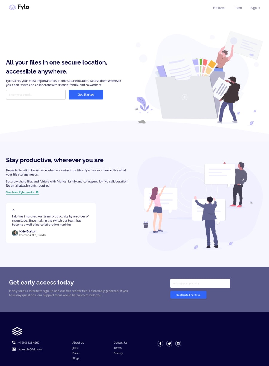
Fylo landing page with two column layout using SCSS Flexbox
Design comparison
Solution retrospective
Hi Frontendmentor community, here is my solution for this challenge .
i'd always appreciate if you drop a feedback or any suggestions... Ty
Community feedback
- @PhoenixDev22Posted over 2 years ago
Hello Vijay K Naik,
Congratulation on completing another frontend mentor challenge. Excellent Work! I have some suggestions regarding your solution if you don't mind:
HTML
- Use the
<form>
tag to wrap the.get-started
.
- look up a bit more about how and when to write alt text on images. Learn the differences with decorative/meaningless images vs important content. For decorative images, you set an empty
alt
to it with anaria-hidden=”true”
to remove that element from the accessibility tree. This can improve the experience for assistive technology users by hiding purely decorative images.
- For the alternate text of the avatar testimonial should not be empty , you can use the avatar’s name
alt=" kyle burton"
.
- For the testimonial , you may use
<blockquote>, <figure>, <figcaption>
.
- About
<h1>
it is recommended not to have more than one h1 on the page . Multiple<h1>
tags make using screen readers more difficult, decreasing your site’s accessibility.
- Use the
<nav >
landmark to wrap the footer navigation witharia-label=”secondary “
oraria-label=”footer”
. A brief description of the purpose of the navigation, omitting the term "navigation", as the screen reader will read both the role and the contents of the label. Thenav
element in the header could use anaria-label="primary"
oraria-label=”main”
attribute on it. The reason for this is that, You should add thearia-label
for a nav element if you are using the nav more than once on the page.you can read more in MDN
In the footer’s logo as it's an informative image , the SVG does not contain any visible text that describes the graphic, we need to add the alternative text (invisible) by:
- <title>A short title of the SVG</title> - Add the appropriate ID’s to the <title> - It must be the first child of it’s parent element
On the <svg> tag, add
aria-labelledby="uniqueTitleID”.
- Never use
<div>
and<span>
alone to wrap a meaningful content. Just keep in mind that you should usually use semantic HTML in place of the div tag unless none of them (the semantic tags) really match the content to group together.* For example , inclass=” contact"
, you may use like<address> ...
tag to wrap the contact information for the author/owner of a document or an article (email and phone number). By adding semantic tags to your document, you provide additional information about the document, which aids in communication.
- Instead of using a generic
div
, Use the<ul>
to wrap the social links . - The social links wrapping the icons must havearia-label
orsr-only
text indicate where the link will take the user. Then you setaria-hidden =”true”
andfocusable=”false”
to the svgs to be ignored by assistive technology and to avoid redundancy and repetition.
<svg aria-hidden="true" focusable="false"> ... </svg>
- It should look like this:
<ul class="social-icons"> <li class=""><a href="#" aria-label="Visit our facebook"> <svg>......</svg></a></li> <li class=""><a href="#" aria-label="Visit our twitter”> <svg>......</svg></a></li> <li class=""><a href="#" aria-label="Visit our instagram"> <svg>......</svg></a></li> </ul>
Aside these , you did great work. Hopefully this feedback helps.
0 - Use the
Please log in to post a comment
Log in with GitHubJoin our Discord community
Join thousands of Frontend Mentor community members taking the challenges, sharing resources, helping each other, and chatting about all things front-end!
Join our Discord