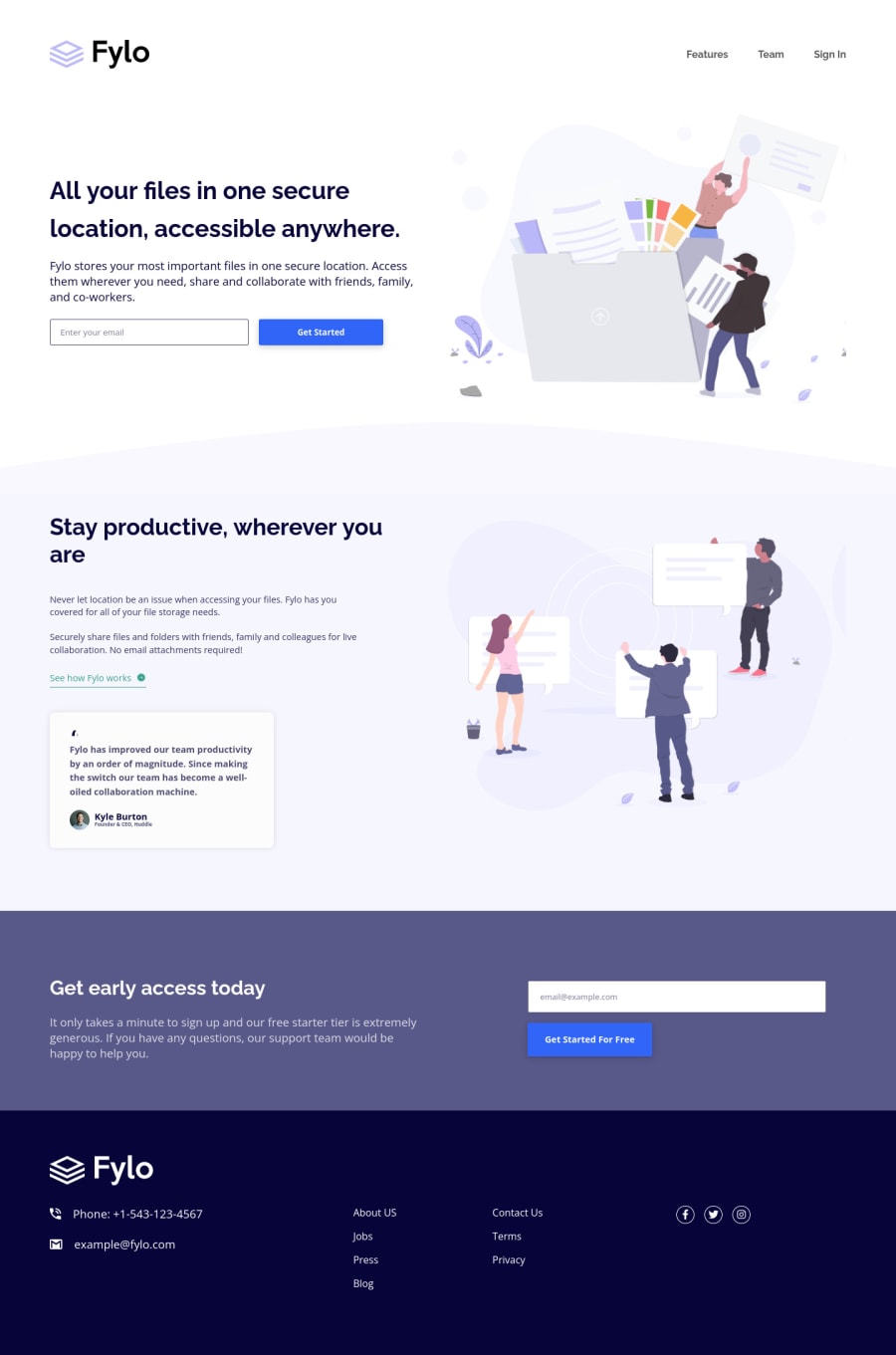
Design comparison
Solution retrospective
First i was wondering how do you add the " Please check your email " on the input when the email is not the right format ? ::before and ::after doesn't work on input tags, and to my knowledge It is not possible to style a parent on child hover (or :invalid in my case) so I am stuck.
Second of all I know my code is very sloppy and I feel kind of bad for putting it out there :). When looking at the design I thought about going in a certain direction, turned out to not be so good and instead of redoing my html and the first part of my css I justed pushed on and kind of brute forced my way out.
I want to keep pushing on challenges with HTML / CSS only to soon start working and learning JS which I am excited about, and will later come back to this challenge and fix my solution.
Community feedback
- @PhoenixDev22Posted about 2 years ago
Hi Dodeun, Glad it was helpful.
- Hiding Content for Everyone:
display: none;
hides the content but also removes it from the accessibility tree so screen readers won’t read it similar tohidden attribute
. - Hiding Content for Screen Readers:
aria-hidden="true"
- Showing Additional Content for Screen Readers: To hide content visually while keeping it in the accessibility tree for screen readers:
.sr-only { border: 0; clip: rect(0 0 0 0); height: 1px; margin: -1px; overflow: hidden; padding: 0; position: absolute; width: 1px; }
Hopefully this makes it clear. Happy coding!
Marked as helpful1 - Hiding Content for Everyone:
- @PhoenixDev22Posted about 2 years ago
Hello Dodeun,
Congratulation on completing this challenge. Excellent work! I have few suggestions regarding your solution, if you don't mind:
HTML
- look up a bit more about how and when to write alternate text on images. Learn the differences between decorative/meaningless images vs important content like
icon-phone, icon-arrow , icon-quotes
andicon-email
.... For decorative images, you set an emptyalt
to it with anaria-hidden=”true”
to remove that element from the accessibility tree. This can improve the experience for assistive technology users by hiding purely decorative images. - Forms with proper inputs and labels are much easier for people to use. To pair the label and input, one way is an explicit label’s
for
attribute value must match its input’sid
value. Input fields without accompanying labels can lead to accessibility issues for those who rely on screen readers. If a screen reader comes across an input field without a label it will try to find some accompanying text to use as the label. (To hide the label visually but present for assistive technology, you may usesr-only
class ). - For
class="contacts"
, you may use like<address> ...
tag to wrap the contact information for the author/owner of a document or an article (email and phone number). By adding semantic tags to your document, you provide additional information about the document, which aids in communication. - Instead of using a generic div to wrap the links
class="internal-links"
, you put your links within an unordered list structure so that a screen reader will read out how many things are in the list to give visually impaired users the most information possible about the contents of the navigation. - The social icons need interactive elements around them which is <a> like:
<li><a href=”#” aria-label=”visit our facebook ”> <i class=”fab fa-facebook”></i></a></li>
- Links must have discernible text. The social links wrapping the icons must have
aria-label
orsr-only
text indicate where the link will take the user. Your icons are purely decorative, you'll need to manually add an aria-hidden attribute to each of your icons. - You can have a look on my solution , it might help. If you have any suggestions, please do leave a feedback.
Aside these, you did great work. Hopefully this feedback helps.
Marked as helpful1@DodeunPosted about 2 years ago@PhoenixDev22 Thanks for the feedback !
- Did not know about
aria-hidden=”true”
I will make sure to use it has i already disliked giving alt to decorative images, I just thought you always had to. - Ok always use labels in forms and i will look into
sr-only
class because i don't know / don't thinkdisplay: none
works. - I dont recall ever seeing that
<address>
was a thing thank you. - You are right, I did at first and had trouble styling them into two columns but i will try harder next time.
- Not the first time I forget the links inside the social icons. But thanks to it and thanks to you I now know I should add
aria-label
for these types of links.
1 - look up a bit more about how and when to write alternate text on images. Learn the differences between decorative/meaningless images vs important content like
Please log in to post a comment
Log in with GitHubJoin our Discord community
Join thousands of Frontend Mentor community members taking the challenges, sharing resources, helping each other, and chatting about all things front-end!
Join our Discord