Not Found
Not Found
Not Found
Not Found
Not Found
Not Found
Not Found
Not Found
Not Found
Not Found
Not Found
Not Found
Not Found
Not Found
Not Found
Not Found
Not Found
Not Found
Not Found
Not Found

Submitted

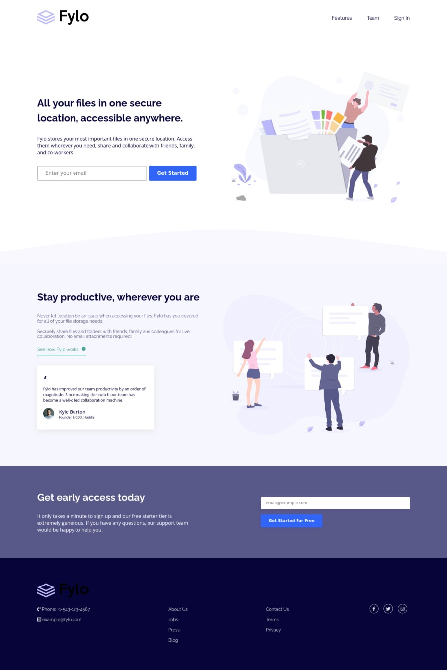
Fylo landing page with two column layout using pure CSS.

Rohitβ€’ 330

@Rohitgour03

Desktop design screenshot for the Fylo landing page with two column layout coding challenge

This is a solution for...

  • HTML
  • CSS
2junior
View challenge

Design comparison


SolutionDesign

Solution retrospective


Here is my solution to this Challenge, Please have a look. Your little suggestion or tip can help me improve as a newbie in the front-end.

Community feedback

P
Daveβ€’ 5,255

@dwhenson

Posted

Hey @Rohitgour03 - nice job here!! πŸ‘

Here's a few small comments for you to consider:

  1. I'd add curser: pointer to your buttons - this seems to be a common convention and what most people expect.

  2. Do you have a label associated with your input elements? You should have, but the FEM accessibility linter isn't picking it up as an error. Here's a nice article that gives a good explanation of why this is: https://css-tricks.com/html-inputs-and-labels-a-love-story/ (you can always hide the label using CSS if you don't want people to see it)

  3. I noted that you sent outline: none on everything. If you remove outline styles then it is important to add back in your own custom outline styles as otherwise it can make it very hard for keyboard users to navigate the page.

If you don’t like the default styles I have found the advice in this article very useful, and use it in pretty much all my projects: https://css-tricks.com/the-focus-visible-trick/

Here's the code I usually add:

/* Add styled focus states on tab not hover */

:focus-visible {
  outline: 3px dotted currentColor;
  outline-offset: 0.25rem;
}

:focus:not(:focus-visible) {
  outline: transparent;
}
  1. Lastly, I think the links in your social icons also need an accessible name - if you don't want to add text adding aria-label: Facebook or whatever to the link itself should solve this problem and get rid of those errors.

  2. Lastly I noted the logo in the footer's color wasn't changing. To do this you either need to inline the svg and change the fill setting, or make a copy of the file and change the fill setting. I find svgs super tricky, so this might not work but it's what I would try!

Great work and keep going!!

Cheers πŸ‘‹

Dave

Marked as helpful

2

Rohitβ€’ 330

@Rohitgour03

Posted

Thanks, @dwhenson. πŸ‘ I will work on all the points that you have mentioned. How to work with SVGs? I have no idea about that. Any good resources to learn about them? and I have to learn about Accessibility.

Thank you for giving your valuable time in giving feedback.

1
Rohitβ€’ 330

@Rohitgour03

Posted

How to set font sizes for different media queries? and Are you on Twitter?

0
P
Daveβ€’ 5,255

@dwhenson

Posted

@Rohitgour03 as I said, I really struggle with svgs. Sara Soudain has great series on them, but it's quite in-depth, but worth a look.

I'm not on Twitter. As for font-sizes in media queries, you set them the same as any other property, it should work.

Marked as helpful

1
MichalTrubiniβ€’ 1,220

@MichalTrubini

Posted

Hello there,

I suggest using this tool to change color of svg files. It works perfectly.

https://codepen.io/sosuke/pen/Pjoqqp

Marked as helpful

1

Please log in to post a comment

Log in with GitHub
Discord logo

Join our Discord community

Join thousands of Frontend Mentor community members taking the challenges, sharing resources, helping each other, and chatting about all things front-end!

Join our Discord