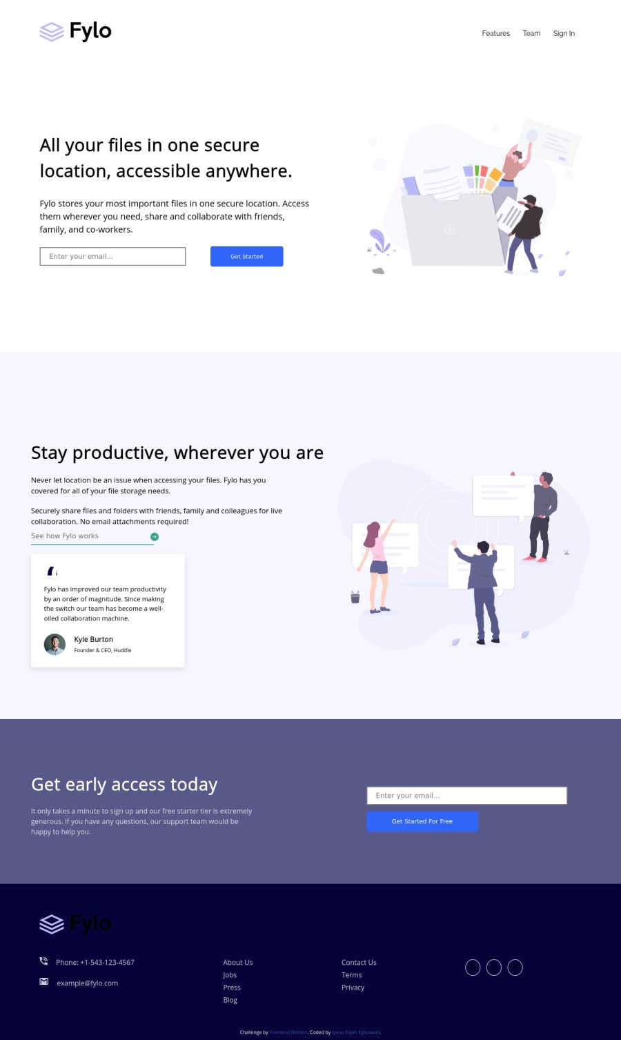
Fylo landing page with two column layout using flexbox
Design comparison
Solution retrospective
Hey mentors,
I know there is an issue with the footer logo colour, I didn't know how to change the image colour to white. also, I don't know why font awesome isn't showing properly.
anyways, I will like to know your feedback on other areas.
I also still have challenges with the naming of the various classes. Is there a guide or special name assigned to different sections of the web?
Thank you
Community feedback
- @grace-snowPosted almost 4 years ago
Hi Iyanu
This looks good but not quite matching the designs yet. The nav links are wrapping onto two lines for me (
sign
on one line,in
on next line) on mobile, for example. Also, pay particular attention to the height, padding, border radius and shadow on inputs and buttons.Your html is pretty well structured - wl done! Just a few small issues :
- take another look at alt text. Think if you turned images of 1) is this image needed and 2) do I understand what it is from that desceiption
- this should be a link not input
<input type="text" placeholder="See how Fylo works"><span class="productive-arrow"><img src="./images/icon-arrow.svg" alt="arrow"></span>
- in your footer you've used two uls for the main links when it should be one list. Look into column properties to display it as columns on desktop
- add accessible link names to icon-only links
Hope thats helpful
1@grace-snowPosted almost 4 years agoA few more tips after looking at css
- I don't think you've applied a color to your social links, may be why they're not showing up?
- youre nesting css heavily at the moment and using element selectors sometimes, neither of these is best practice. Try to classes on every element you want to style, and use single class selectors in css
- I notice you're using a lot of explicit margins in pixels on elements. Try to use consistent margins on layout blocks (eg. Margin auto on the sides to center content) or text blocks (eg all paragraphs get a default margin top). Let the units like flex-basis, fr, max or min widths etc define how big or small stuff should be, not margins
Asking about class naming, some of that comes down to personal preference. I could suggest naming conventions for you, but it's probably better if you read up about CSS naming conventions yourself and see what you like best. Eg I like BEM, others don't. The goal of any approach is usually to create reusable classes, or reusable chunks of css that you can apply to classes.
Good luck with it
0
Please log in to post a comment
Log in with GitHubJoin our Discord community
Join thousands of Frontend Mentor community members taking the challenges, sharing resources, helping each other, and chatting about all things front-end!
Join our Discord