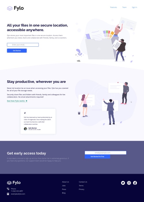
Design comparison
Solution retrospective
👾 Hello, Frontend Mentor coding community. This is my solution for the Fylo Landing Page With Two Column Layout challenge.
This was a quick challenge and I did not customize it. I'm in my journey to finish all HTML and CSS only challenges
now I miss only 6. I'll customize only the last 3 one that are really amazing premium solutions!
🍚Follow me in my journey! Gotta Catch ’Em All
PS: I'm aware of the accessibility errors but this time I'll skip it and go to the next challenge. 🥱
Happy to hear any feedback and advice!
Community feedback
- @sanba-anassPosted over 2 years ago
just uploaded my solution too lol. you really did a good job Lucas well done! can you leave a feedback one mine thanks in advance!
Marked as helpful1 - @sanba-anassPosted over 2 years ago
hi Lucas I notice one little issue on the card in the second section is not lined up correctly with the rest of the content u can use
align-self: start
to fix it :)Marked as helpful0@correlucasPosted over 2 years ago@anasssanba1 Thanks Anass for the time you spent analyzing my code! I'll fix that ASAP.
1 - @Deevyn9Posted over 2 years ago
Hi Lucas, congrats on completing this project, there isn't any significant issue to point out, but I found a minor issue that should add more value to your solution, the paragraph under the "get early access today" is extending farther than it is meant to be, you can limit this using a max-width on it.
I hope you find this helpful.
Happy Coding!
Marked as helpful0@correlucasPosted over 2 years ago@Deevyn9 Thank you Divine I appreciate that you went through my code and spent time writing this comment. I'll fix that for sure. Have a nice day.
1 - @Source-WebPosted over 2 years ago
Hi Lucas... Congrats on finishing this project... There are things you may need to fix. The mobile Navbar is not responsive and the logo for mobile seems too big, consider scaling it or reducing the height and width.
Also, the input field and button of the section before the footer is overflowing y.
:)
Marked as helpful0 - @AdrianoEscarabotePosted over 2 years ago
Salve lucas! Mano ficou bom demais, gostei muito do resultado do projeto em resoluções maiores!
Tenho uma dica para melhorar ainda mais a responsividade do projeto!
Observei que ele estava quebrando devido ao
input-mail
, para arrumar isso podemos efetuar o seguinte:@media (max-width: 900px) .input-mail { width: 80%; }
Faça o teste!
O resto está ótimo!
Espero que ajude... 👍
Marked as helpful0@correlucasPosted over 2 years ago@AdrianoEscarabote Vou arrumar isso, fico até com medo de olhar painel da solução pq está dando mais de 30 erros e eu nem gosto de trabalhar com formulários hahahahha valeu!
1 - @denieldenPosted over 2 years ago
Hi Lucas, congratulations great job! 😁
Some little tips:
- add
header
tag and wrap the navbar to improve the Accessibility - remove all unnecessary code, the less you write the better as well as being clearer: for example the
div
container of logo image - use
nav
tag only to contain the navigation link - to remove the blue border of input when you click in it add
outline: none
- to
form-1
class not need flexbox - not use
<br>
to create space between elements because it is only to break the lines of text, use themargin
to create space between theinput
and thebutton
- instead of using
px
use relative units of measurement likerem
-> read here
Hope this help! Happy coding 😉
3 - add
- @johnnysedh3llloPosted over 2 years ago
heyyy Lucas, good job finishing your solution. such a coincidence that i just submitted the same one 😅. good one bro
1@correlucasPosted over 2 years ago@johnnysedh3lllo I saw your solution! I wanted to left a comment that but everything seems really good! About the form validation I'm a newbie too so I cannot help you yet! Congrats bro =)
1 - @MahmoudKasrawyPosted over 2 years ago
@correlucas hi , congratulation i don't know how to adjust the height and width of the picture especially if it's in a div. can you tell me how to adjust it?please
1@correlucasPosted over 2 years ago@MahmoudKasrawy in which solution bro? Usually I add
display: block
andmax-width: 100%
to make the image fit inside the div with the automatic height. Send me the solution and I take a look for you.1@MahmoudKasrawyPosted over 2 years ago@correlucas you add display: block and max-width: 100% to image or div content this image?
0@correlucasPosted over 2 years ago@MahmoudKasrawy to the img selector like this:
img { display: block; max-width: 100%; }
1@MahmoudKasrawyPosted over 2 years ago@correlucas the div that contains the pictuer , how i add height and width of this div?
0 - @EmersonHenrique33Posted over 2 years ago
Será que um dia chego nesse nível!? :) Vou continuar treinando para ficar bom assim. Eu tenho um pouco de dificuldades com posicionamento e organização mas não vou desistir rsrs.
0@correlucasPosted over 2 years ago@EmersonHenrique33 Claro que chega irmão. Há 3 meses atrás eu tava fazendo o desafio do QR Code e sabia pouca coisa, a cada desafio vc vai melhorando, vc vai daqui há 1 mes vc vai tá fazendo esse =)
1
Please log in to post a comment
Log in with GitHubJoin our Discord community
Join thousands of Frontend Mentor community members taking the challenges, sharing resources, helping each other, and chatting about all things front-end!
Join our Discord