Submitted over 3 years ago
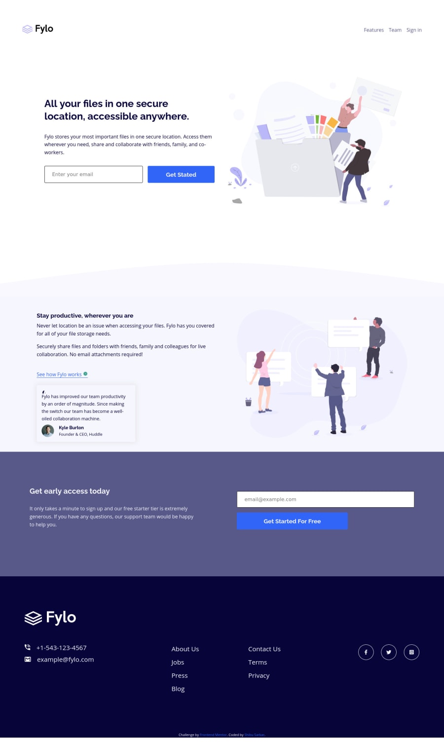
Fylo landing page with two column layout - Mobile first
@shibuwd
Design comparison
SolutionDesign
Solution retrospective
Need feedback.
Community feedback
- @vanzasetiaPosted over 3 years ago
👋Hi Shibu Sarkar!
First thing you need to know is that, I opened this solution on my mobile phone, which meant everything that I said was based on what I saw on my mobile device (360px width).
I have some feedback for this solution:
- The page is not 100% width, it's showing a white color on the right side.
- The header logo and the nav links are too small and the they are side by side.
- You should have email validation, you can just use CSS
:invalidfor that (no need JavaScript). - The
See how Fylo Workslink color is blue, while it should green color from thestyle-guide.md. - The footer text is too big, try to make it smaller.
- The social icons on footer is too small.
- For the logo
altattribute, you cam just say the company nameFylo, no need thelogo. - For the useless or meaningless images, you should just leave the
alt=""attribute empty.
That's it! Hopefully this is helpful!
Marked as helpful0@shibuwdPosted over 3 years ago@vanzasetia Thank you so much for your great suggestion. I will fix it ASAP.
0 - @A-amonPosted over 3 years ago
Hello! Great work~ About the overflowing picture tag, try using transform:scaleY instead of scale so that it only scale vertically. And I think the footer might need some padding and some adjustments to the font size.
Marked as helpful0
Please log in to post a comment
Log in with GitHubJoin our Discord community
Join thousands of Frontend Mentor community members taking the challenges, sharing resources, helping each other, and chatting about all things front-end!
Join our Discord
