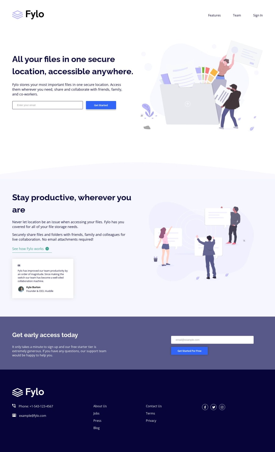
Design comparison
SolutionDesign
Solution retrospective
Hello there! This is my code solution for the "Fylo Landing Page with Two Column Layout" challenge.
I would love to receive some feedback. I'm eager to learn and improve my coding skills, so any constructive criticism or suggestions for improvement would be greatly appreciated.
Thank you in advance for taking the time to review my work, and I look forward to hearing your thoughts!
Community feedback
- @afaiz-spacePosted about 1 year ago
@Deepali25-Kv, hi..... I noticed some issues in your design.
- Header content is overflowing. The ul tag in the footer also has an overflow
0
Please log in to post a comment
Log in with GitHubJoin our Discord community
Join thousands of Frontend Mentor community members taking the challenges, sharing resources, helping each other, and chatting about all things front-end!
Join our Discord
