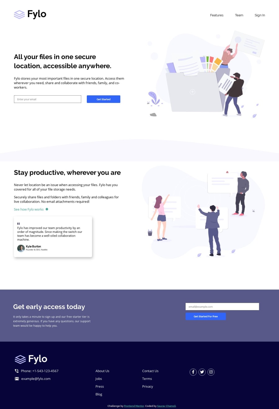
Fylo landing page with two column layout (Html,Scss & Animations)
Design comparison
Solution retrospective
Any suggestions or criticism is most welcome!
Community feedback
- @mattstuddertPosted almost 5 years ago
Nice work, Saurav! Your solution looks really good. The only small thing missing is the
background-coloron the "Stay productive, wherever you are" section. Keep up the great work!0@sauravchamoli17Posted almost 5 years ago@mattstuddert Thank you very much matt! for reviewing my solution.I will change the background color on that section. What about the animations? Am I doing them right?
0@mattstuddertPosted almost 5 years ago@sauravchamoli17 the way you're doing them is absolutely fine. It's great to play around with content animations. In production, I tend to use them very lightly though as they can be quite distracting. But that's just a personal preference 🙂
0@sauravchamoli17Posted almost 5 years ago@mattstuddert Is intersection observer the only way possible to trigger animatons on scroll without using any external library?
0@mattstuddertPosted almost 5 years ago@sauravchamoli17 yeah, that's the way I'd go about it. There are other ways, but that's the simplest.
0@sauravchamoli17Posted almost 5 years ago@mattstuddert Okay! Thanks for your valuable time.
0
Please log in to post a comment
Log in with GitHubJoin our Discord community
Join thousands of Frontend Mentor community members taking the challenges, sharing resources, helping each other, and chatting about all things front-end!
Join our Discord
