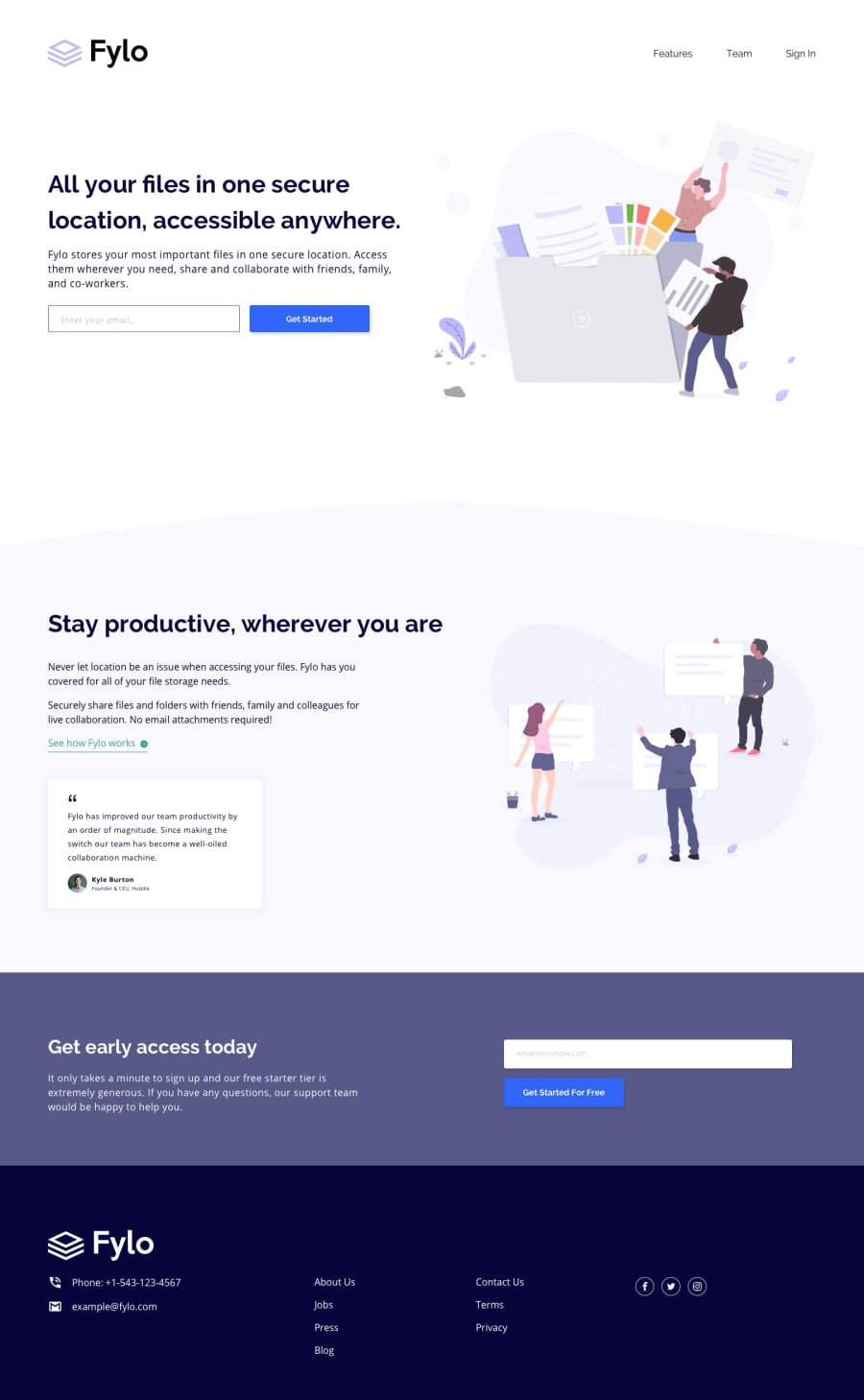
Design comparison
Solution retrospective
Use flexbox to solve the challenge. I think I did fairly well, any advice is helpful...
Community feedback
- @VCaramesPosted about 2 years ago
Hey @fruizotero, some suggestions to improve you code:
-
The Alt Tag description in the logo needs to be improved upon. The logo is arguably the most important image in you page. So the description should state the company name.
-
The Illustrations serve no other purpose than to be decorative; They add no value. Their Alt Tag should left blank and have an aria-hidden=“true” to hides it from assistive technology.
-
The headings are being used incorrectly. When creation a full landing page (like this one) you always start with the <h1> Heading. After that, you use the next level of headings.
-
The phone and email on the footer should be wrapped in Anchor Tags and set the href in the following manner so users can click on them and the phone/email app can open automatically:
Phone:
<a href="tel:+1-543-123-4567">Phone: +1-543-123-4567</a>Email:
<a href="mailto:[email protected]">[email protected]</a>- I recommend adding a third layout to make the transition from mobile 📱 -> desktop 🖥 views smoother.
Happy Coding! 👻🎃
Marked as helpful0 -
Please log in to post a comment
Log in with GitHubJoin our Discord community
Join thousands of Frontend Mentor community members taking the challenges, sharing resources, helping each other, and chatting about all things front-end!
Join our Discord
