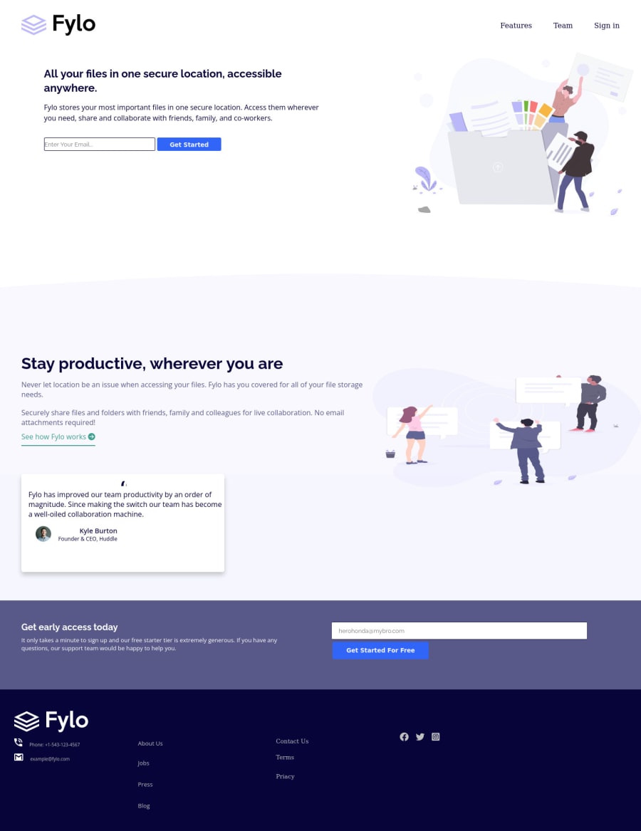
Design comparison
Community feedback
- @suyog-bhandariPosted almost 2 years ago
Hi there, I have some suggestions about your code that might help you.
-
give padding to the input or the text will collide with the border and don't look good.
-
Social media icons should typically be anchor elements because anchor elements allows users to easily click on the icon and be taken directly to the company's social media profile page. This makes it easy for users to connect with the company on social media.
-
In the testimonial section, the name of person and his post both should start from same place, one starting from the start and another in the center is a bad practice. Hope you find it helpful!!
Marked as helpful0 -
Please log in to post a comment
Log in with GitHubJoin our Discord community
Join thousands of Frontend Mentor community members taking the challenges, sharing resources, helping each other, and chatting about all things front-end!
Join our Discord
