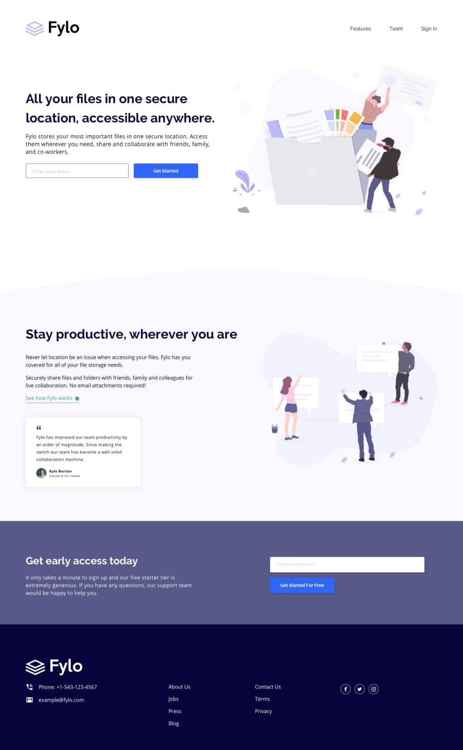
Design comparison
SolutionDesign
Solution retrospective
I appreciate any feedback or suggestions you have regarding the solution.
Community feedback
- @vanzasetiaPosted over 1 year ago
Hi, Aayush Jaiswal! 👋
I recommend providing the non-minified CSS for people to see. Otherwise, it is hard for people to give feedback your CSS.
I have some feedback on improving your solution.
- Alternative text of the logo should not be "logo". It should be the company name, "Fylo".
- Keep in mind that any words that are related to "image" (for example, picture, photo, logo, icon, graphic, and avatar) should not be included in alternative text.
- Not every image needs alternative text. Decorative images should not have alternative text (
alt=""). This will tell the screen reader to skip over the image. As a result, it saves screen reader users time navigating the page. - For your information, decorative images are images that don't add any information and serve only aesthetic purposes.
- Each email input should have
type="email"and a label. Since there is no visible label on the design, you can usearia-labelattribute to label each email input. - Replace the second and the third
<h1>with<h2>. There should not be more than oneh1on a page. Many<h1>elements mean many titles which can confuse the users, especially the screen reader users. - You should not omit the
altattributes for decorative images. - Wrap each of the social media icon with an anchor tag. It is a social media link of the company.
I hope this helps. Happy coding! 😄
0
Please log in to post a comment
Log in with GitHubJoin our Discord community
Join thousands of Frontend Mentor community members taking the challenges, sharing resources, helping each other, and chatting about all things front-end!
Join our Discord
