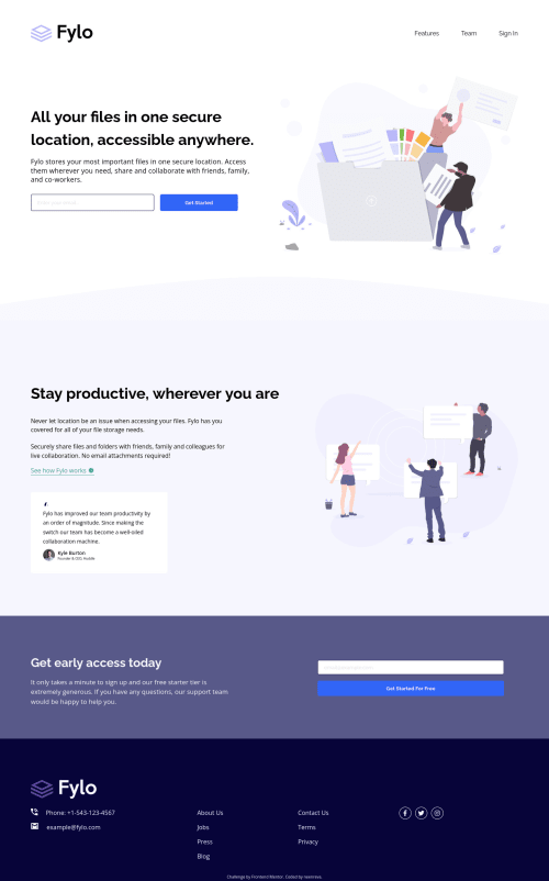
Design comparison
Solution retrospective
This is a good junior level challenge to practice on. I challenged myself to knock this out in a day(8hrs). That didn't happen! I noticed that I end up having to go back to the markup to add complexity due to needs. My challenges start with me jumping straight into the IDE and that leads me to too many revisions. On the scale of complexity I feel pretty close to the bottom here and I can imagine the time saved will add up.
I want to work toward being able to develop something like this within a day. Going forward I'm going to practice pseudo coding to develop better structure from the beginning. I hope to better identify issues like, needing a container or best properties for the use case.
As always feedback is welcome! Thanks for checking this out.
Community feedback
- @PhoenixDev22Posted over 2 years ago
Hello James,
Congratulation on completing this challenge.
Excellent Work! I have some suggestions regarding your solution if you don't mind:
HTML
-
The action attribute specifies where to send the form-data when a form is submitted. Possible values: - an absolute URL or a relative URL
-
For the alternate text of the testimonials avatar should not be
User avatar
. It’s meaningless, you can use the avatar namealt=" kyle burton"
. -
[look up a bit more about how and when to write alt text on images. Learn the differences with decorative/meaningless images vs important content] (https://www.w3.org/WAI/tutorials/images/decorative/) like
icon-phone, icon-arrow, icon-quote
, andicon-email
are decorative. For decorative images, you set an emptyalt
to it with anaria-hidden=”true”
to remove that element from the accessibility tree. This can improve the experience for assistive technology users by hiding purely decorative images. -
Wrap the social icons in
<a>
. The links wrapping the icons must havearia-label
orsr-only
text indicate where the link will take the user. Then you setaria-hidden =”true”
to the icons to be ignored by assistive technology. -
You may use the
<address>
tag to wrap the contact information for the author/owner of a document or an article (email and phone number.) -
Adding
rel="noopener"
orrel="noreferrer"
totarget="_blank"links
. When you link to a page on another site usingtarget=”_blank”
attribute , you can expose your site to performance and security issues. -
Forms with proper inputs and labels are much easier for people to use. To pair the label and input, one way is An explicit label’s
for
attribute value must match its input’sid
value. Input fields without accompanying labels can lead to accessibility issues for those who rely on screen readers. If a screen reader comes across an input field without a label it will try to find some accompanying text to use as the label. (To hide the label visually but present for assistive technology, you may usesr-only
class ) -
Consider specifying the type of the button in the form to avoid any unexpected bugs.
-
Use the
<nav >
landmark to wrap the footer navigation witharia-label=”secondary “
oraria-label=”footer”
. A brief description of the purpose of the navigation, omitting the term"navigation"
, as the screen reader will read both the role and the contents of the label. The nav element in the header could use anaria-label="primary"
oraria-label=”main”
attribute on it. The reason for this is that, You should add the aria-label for a nav element if you are using the nav more than once on the page. This will make it unique.you can read more in MDN
Aside these, Great work ! Hopefully this feedback helps.
Marked as helpful0@neenrevaPosted over 2 years ago@PhoenixDev22 Absolutely incredible feedback! Thanks for taking time to review and explain all this. I will get on fixing these and note it for the future.
1 -
Please log in to post a comment
Log in with GitHubJoin our Discord community
Join thousands of Frontend Mentor community members taking the challenges, sharing resources, helping each other, and chatting about all things front-end!
Join our Discord