Submitted over 2 years ago
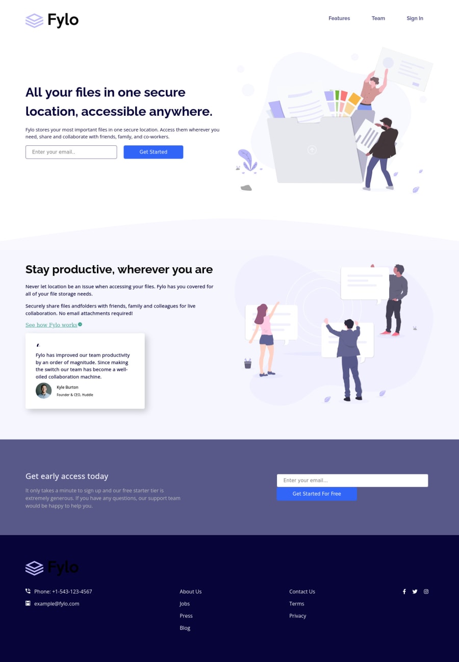
Fylo landing page with two column layout

@sarvothamgowda

Design comparison
SolutionDesign

Solution retrospective
Hi folks,
Currently, the website is optimized only for desktop and tablet versions. The Mobile version seems to be complicated. I have a few questions tho.
-
The header, central part, and footer are not wrapped in a single container. Instead, I have made them as individual items. Is it good practice?
-
What is the correct way to add a circle border to the social media icons?
Open to other feedback as well.
Thanks for reviewing my work!
Please log in to post a comment
Log in with GitHubCommunity feedback
No feedback yet. Be the first to give feedback on Sarvotham Gowda's solution.
Join our Discord community
Join thousands of Frontend Mentor community members taking the challenges, sharing resources, helping each other, and chatting about all things front-end!
Join our Discord