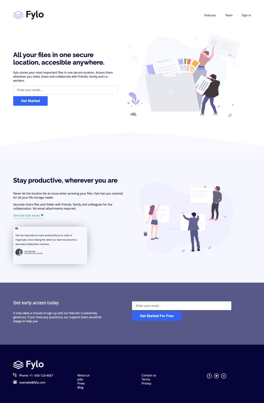
Design comparison
Community feedback
- @mattstuddertPosted over 5 years ago
Hey Lucas, your site looks great! Quick heads up that your repo link currently navigates to the wrong GitHub repository though 👍
Here are a few things I've seen from looking at your code:
-
You're currently using lots of
divelements for your HTML structure. I'd recommend swapping out some of those for semantic HTML5 elements likeheader,footer,section,main. If you would like to read up on HTML5 elements, here is a great article from freeCodeCamp. -
You're using more than one
h1on the page, which I'd recommend against doing for accessibility and general content hierarchy reasons. -
For the curved edge on the testimonial section you're using the
imgtag. Because this is for purely decorative reasons I would recommend using thebackground-imageproperty in CSS instead so that it is not adding content to the HTML unnecessarily. -
Great work on the CSS, the page looks great!
Hope those tips help and keep up the great work! 🙂
2@gomezlucasPosted over 5 years agoThanks Matt! Very useful your advice. I'll definitely do it that way in my next challenge and I'll change this code later as well.
0 -
Please log in to post a comment
Log in with GitHubJoin our Discord community
Join thousands of Frontend Mentor community members taking the challenges, sharing resources, helping each other, and chatting about all things front-end!
Join our Discord
