Submitted about 2 years ago
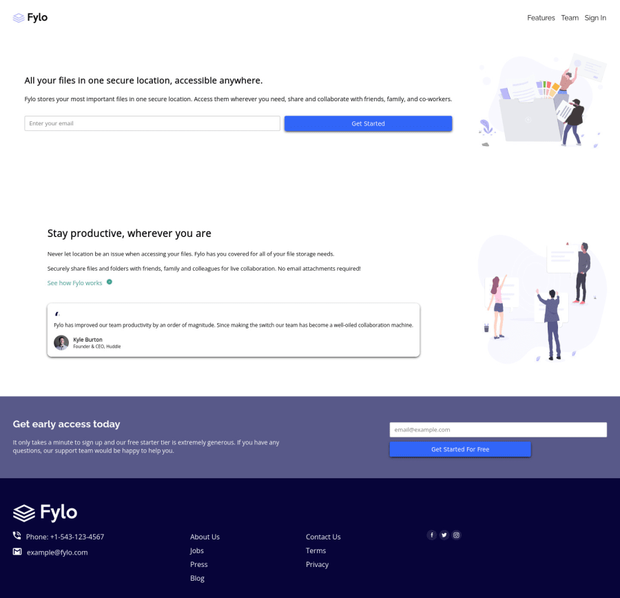
Fylo landing page with two column layout
@BenChi3D
Design comparison
SolutionDesign
Solution retrospective
I would like to know how I can make an image responsive and scale with the screen size of a device, that gave me issue. Thanks
Community feedback
- @JoelLHPosted about 2 years ago
Hey Great Job!. For the images you can use a combination of min-width, max-width and width.
- min-width : will set the minimum width u like your image to be example: 300px;
-max- width: sets the maximum width example: 600px;
- lastly width: 100% will let the image be as large as any pixels between 300px and 600px; Hope this helps, happy coding!
Marked as helpful1 - @BenChi3DPosted about 2 years ago
Wow thank you. I am really grateful for your response and feedback.
0
Please log in to post a comment
Log in with GitHubJoin our Discord community
Join thousands of Frontend Mentor community members taking the challenges, sharing resources, helping each other, and chatting about all things front-end!
Join our Discord
