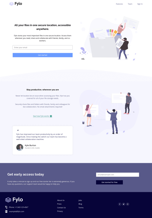
Fylo landing page with two column layout

Solution retrospective
** Hello, Frontend Mentor coding community. This is my solution for the challenge Fylo landing page .**
Not really proud of the organization of my css, I know right I've made a mess, could've done it better, the svgs that I imported directly to the html because i didn't know how to change the color of an svg other than changing the property Fill: '#fff'
It was a good challenge i learned how to mix grids and flexboxs together and it's too beautiful and much easier to execute.
Feel free to leave any feedback about my design chances and help me improve my solution.
Please log in to post a comment
Log in with GitHubCommunity feedback
No feedback yet. Be the first to give feedback on 101Amine's solution.
Join our Discord community
Join thousands of Frontend Mentor community members taking the challenges, sharing resources, helping each other, and chatting about all things front-end!
Join our Discord