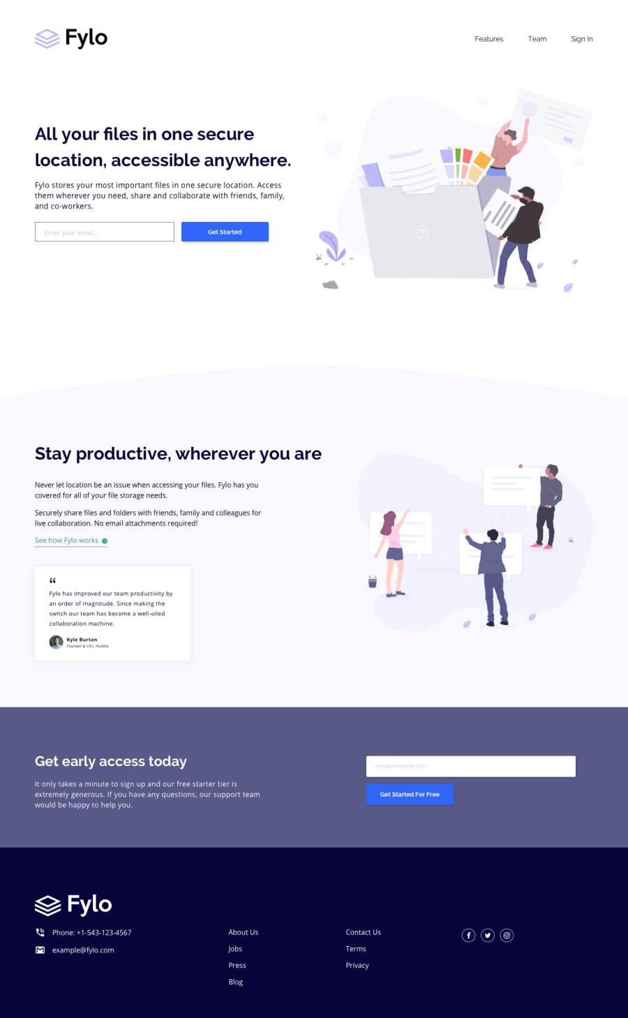
Design comparison
Community feedback
- @tuhamworldPosted over 1 year ago
Hello there,
Kudos for submitting the solution on the Fylo landing page.
I have a few comments on your solution.
-
The font being used for the Menu does not seem like the same font family specified in the project
-
There seems to be some empty white space at the bottom of your landing page solution. Just wanted to call your attention to it
You might want to look into this. Best regards
1@OmprakashRPosted over 1 year ago@tuhamworld thank you for your comments..
. Noted. Menu links are not looking the same as per the design i will update that.
About the white space .that comes because of the website's full High completed in min area compared to the challenge design. I will update that too
0@tuhamworldPosted over 1 year ago@OmprakashR You are welcome and glad to be of help.
In addition, there is also a placeholder in the email field but yours seems to be missing the placeholder.
You can look into this as well.
Happy coding
0 -
Please log in to post a comment
Log in with GitHubJoin our Discord community
Join thousands of Frontend Mentor community members taking the challenges, sharing resources, helping each other, and chatting about all things front-end!
Join our Discord
