Design comparison
SolutionDesign
Solution retrospective
Day by day we are slowly getting the hang of things. Still a few things that I can't get. I also seem to be going back and adding more html but I'm trying to look at the designs more and figure our what I have to write before I even start my project. Seems like my html is setting me back a bit when I do projects so trying to work on that.
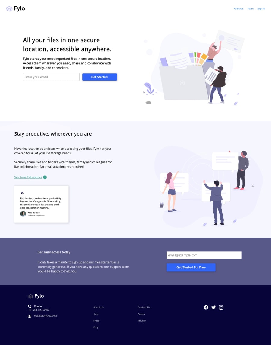
- The social logos at the bottom, I always have trouble adding a background color on it for the active and hover states, as well as changing the fylo logo, if anyone can tell me the best way to get this done that would be great.
- Also had trouble with the background image for some reason, if I can get a tip on what I could've done.
Any tips and comments help
Community feedback
Please log in to post a comment
Log in with GitHubJoin our Discord community
Join thousands of Frontend Mentor community members taking the challenges, sharing resources, helping each other, and chatting about all things front-end!
Join our Discord
