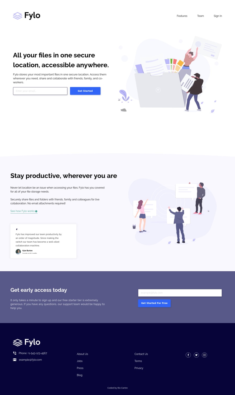
Design comparison
SolutionDesign
Solution retrospective
Making this project, I started with the desktop workflow and eventually added media queries for smaller screen view. Built with React which compose of five components with individual style files and added screenshots. In the process, I struggled on some aspect that needs attention:
- Overlay of icons in hover state
- Smooth media queries on every break points
- The full width of the background image
Overall, I'm learning ways to be more comfortable with React and continue learning new ways to implement efficiently.
Community feedback
Please log in to post a comment
Log in with GitHubJoin our Discord community
Join thousands of Frontend Mentor community members taking the challenges, sharing resources, helping each other, and chatting about all things front-end!
Join our Discord
