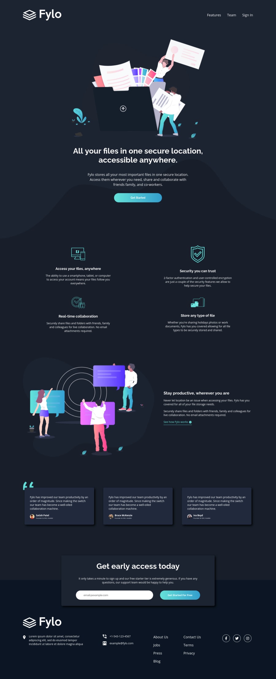
Design comparison
Solution retrospective
Hi everyone,
Nice to meet you. And I hope to receive your feedback for my solution.
Many thanks.
Community feedback
- @ChamuMutezvaPosted over 3 years ago
- when i use a keyboard to operate the site, i can hardly see where i am on the page.
- you did well with responsiveness but there is room for improvement especially on medium devices . Check close to the footer section (769px and 820px)
- input elements must have a label for accessibility. Assistive tech users will not know of the expectation when labels are not present
Marked as helpful0@tttinhPosted over 3 years agoHi @ChamuMutezva,
Thanks for your kind words. For the first point, would you please guide me how to improve it?
Best regards.
0@ChamuMutezvaPosted over 3 years ago@tttinh, the
outlineis by default set by the browser. Customize it so that it can be identified when focus is on interactive elements. Eg a button with a class ofbtncan be changed as in sass :.btn { outline : none; &:focus, &:hover { outline: 2px solid red; } }Check the following repository focused, hovered
0
Please log in to post a comment
Log in with GitHubJoin our Discord community
Join thousands of Frontend Mentor community members taking the challenges, sharing resources, helping each other, and chatting about all things front-end!
Join our Discord

