Design comparison
Solution retrospective
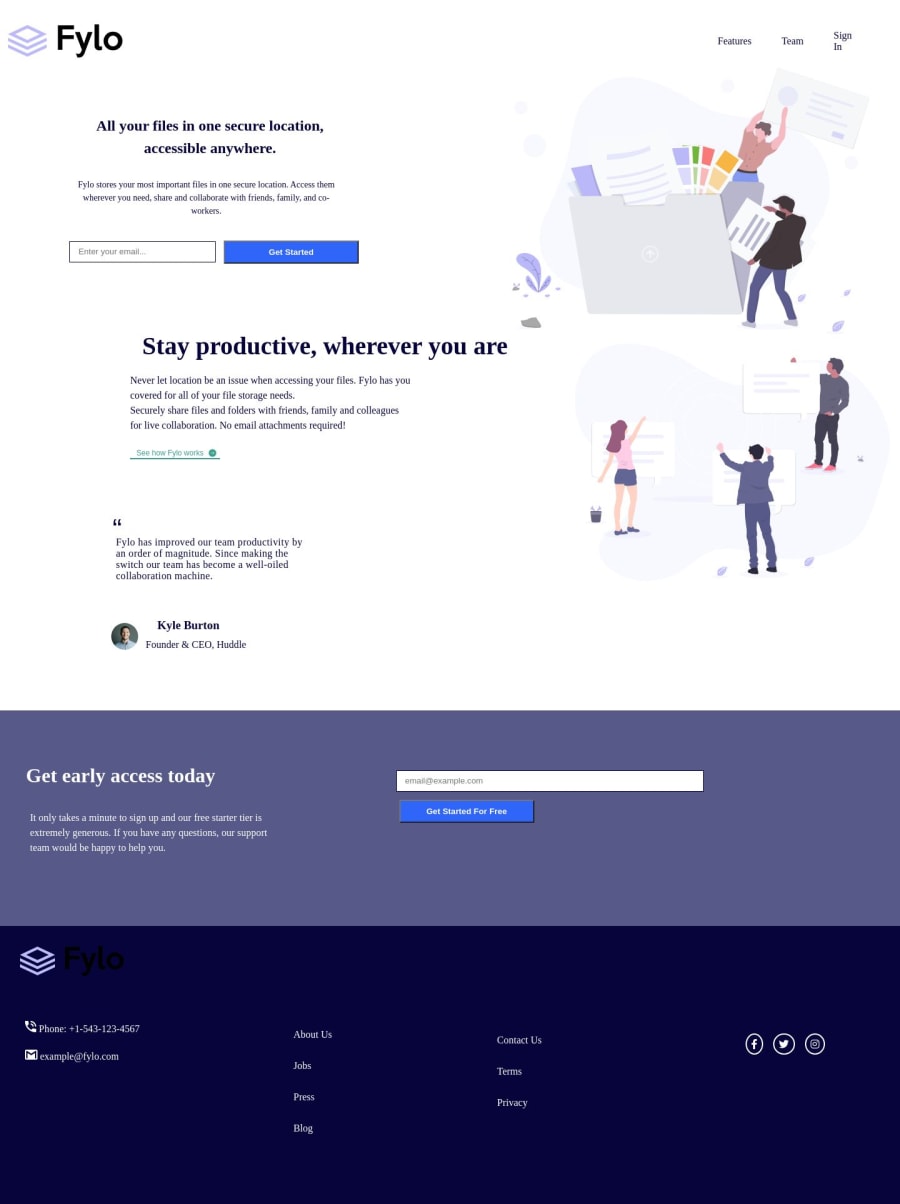
I did mostly follow the design here but ran into two issues I could not solve. Firstly, no matter how much I tried to tweak the width, I could not get the "sign in" text at the top to go onto a single line. Second is the logo in the footer which did not want to become white regardless of what property I tried to use (fill, color and a few others were all tried but none worked).
If you want to have a look and see if you can fix this then be my guest.
Please log in to post a comment
Log in with GitHubCommunity feedback
- @JeuriMorel
To prevent the Sign In text from wrapping, you can give your
liswidth: max-content;. If you want to learn more about how this works you can read the docs here.As for the
imgcolor, I don't think you can change the fill of ansvgthat is brought in as an img, you'd have to add thesvgto the HTML. If there were only one thing in the image I would tell you to use a filter, for example:filter: invert(1);But that inverts the color for everything in it, including the logo.
Join our Discord community
Join thousands of Frontend Mentor community members taking the challenges, sharing resources, helping each other, and chatting about all things front-end!
Join our Discord
