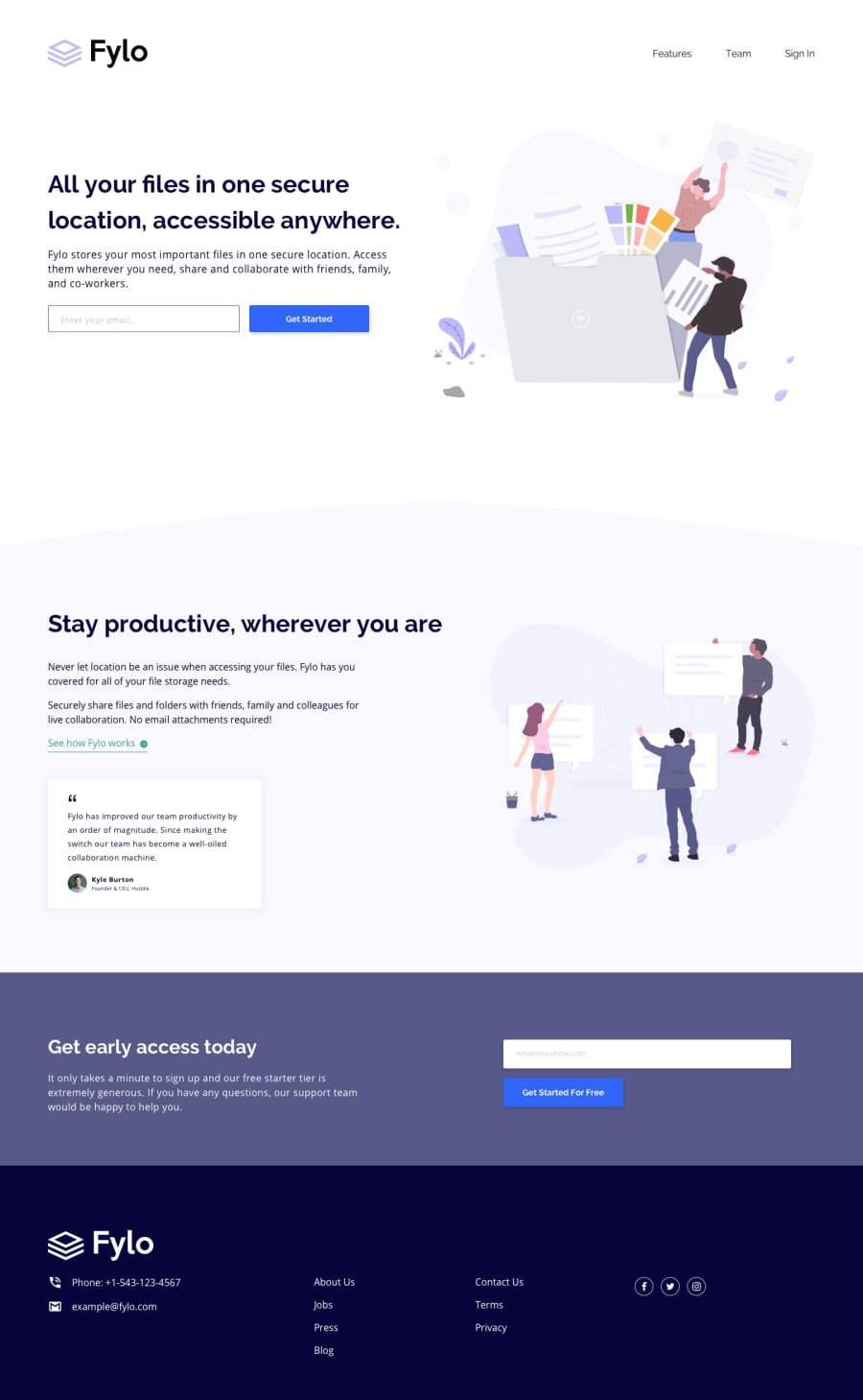
Design comparison
Solution retrospective
This was a bit more challenging than I had expected.
First of all, some of the colors for the fonts wasn't included in the style guide and logos were not provided for social media icons so I could not get the most accurate svgs online but I have tried to keep them as similar as possible. Also, in the footer, font weight is less than 400 but it is not mentioned so in style guide. So, the font in footer looks a bit more thick than it is supposed to be.
I've tried to replicate the design as much as possible. Please let me know if I am missing anything or if it could have been done in a better way.
Community feedback
Please log in to post a comment
Log in with GitHubJoin our Discord community
Join thousands of Frontend Mentor community members taking the challenges, sharing resources, helping each other, and chatting about all things front-end!
Join our Discord
