


Design comparison
Solution retrospective
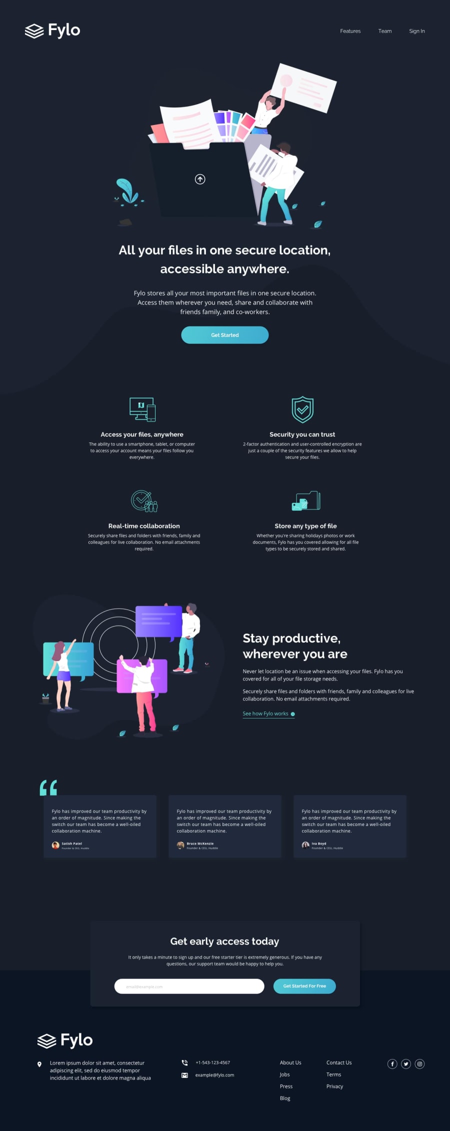
This time I had some problems with the curvy image as the background when the screen size changes. Finally I think I achieved it.
And in the container to indicate the email I have a problem that I didn't know how to fix. In this one I used absolute position to be able to place it in the middle of the beginning of the footer and I gave it a max-width
On desktop it looks good, it is centered and the container does not occupy the entire width of the viewport. But in mobile the width takes 100% of the viewport width, and i need this to have some margin
I would like to know how it could be done in these cases, thanks in advance.
Community feedback
Please log in to post a comment
Log in with GitHub
Join our Discord community
Join thousands of Frontend Mentor community members taking the challenges, sharing resources, helping each other, and chatting about all things front-end!
Join our Discord