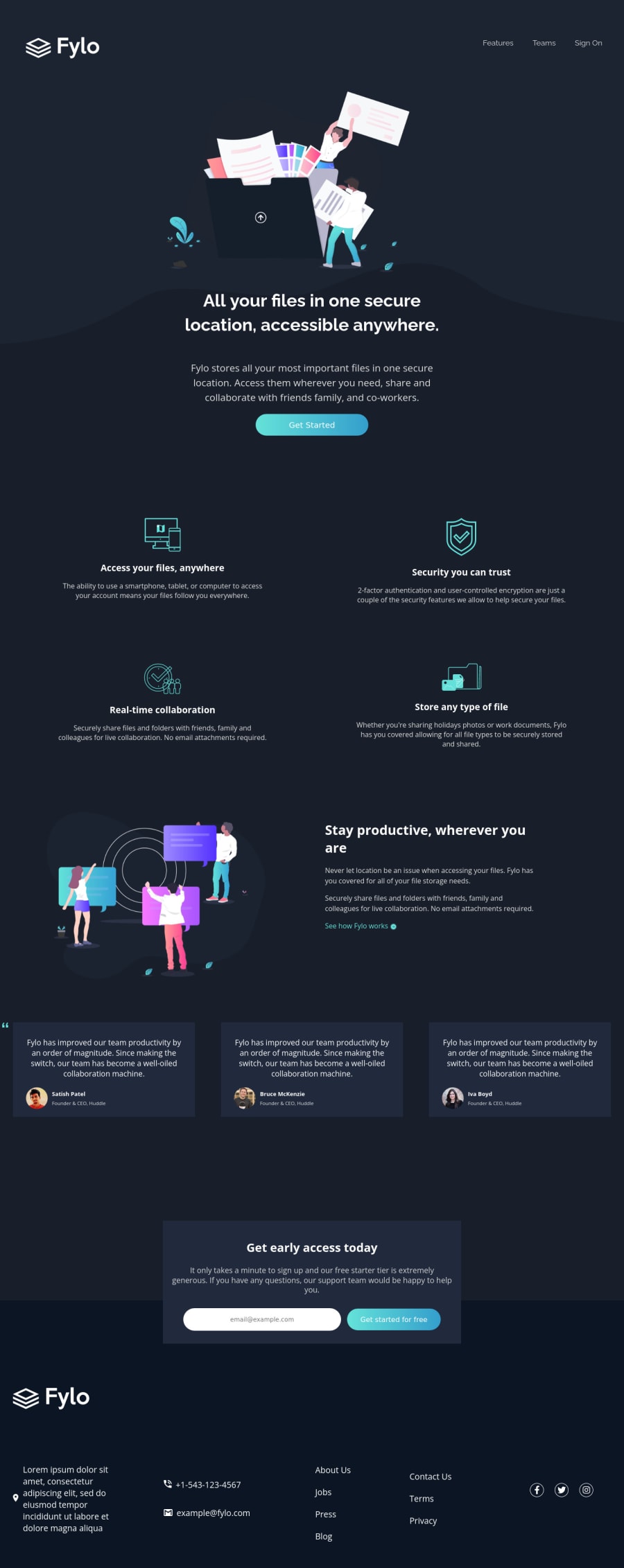
fylo landing page using html, css, and vanilla javascript
Design comparison
Solution retrospective
I'm unsure on why there's large space in between the gaps of my columns in my footer section. Is there a better way to reduce the gap in those columns rather than set a fixed width for the columns? Is it alright to create a different stylesheet for the media queries, so I don't have to include them all in one styles.css? Any constructive feedback is very valuable. Took me a while to complete, but I had fun coding and learning in the process.
Community feedback
- @ritadoumetPosted almost 3 years ago
Your website looks great! You definitely matched the style to a high degree. Kudos to you! However, I think you should optimize the website for bigger screens, as it looks stretched out on a desktop screen. Also, some buttons, when hovered over, do not look clickable. You should just set the cursor to a pointer. Good job for using semantic HTML and reusable JavaScript functions. Keep up the good work! :)
Marked as helpful1
Please log in to post a comment
Log in with GitHubJoin our Discord community
Join thousands of Frontend Mentor community members taking the challenges, sharing resources, helping each other, and chatting about all things front-end!
Join our Discord
