
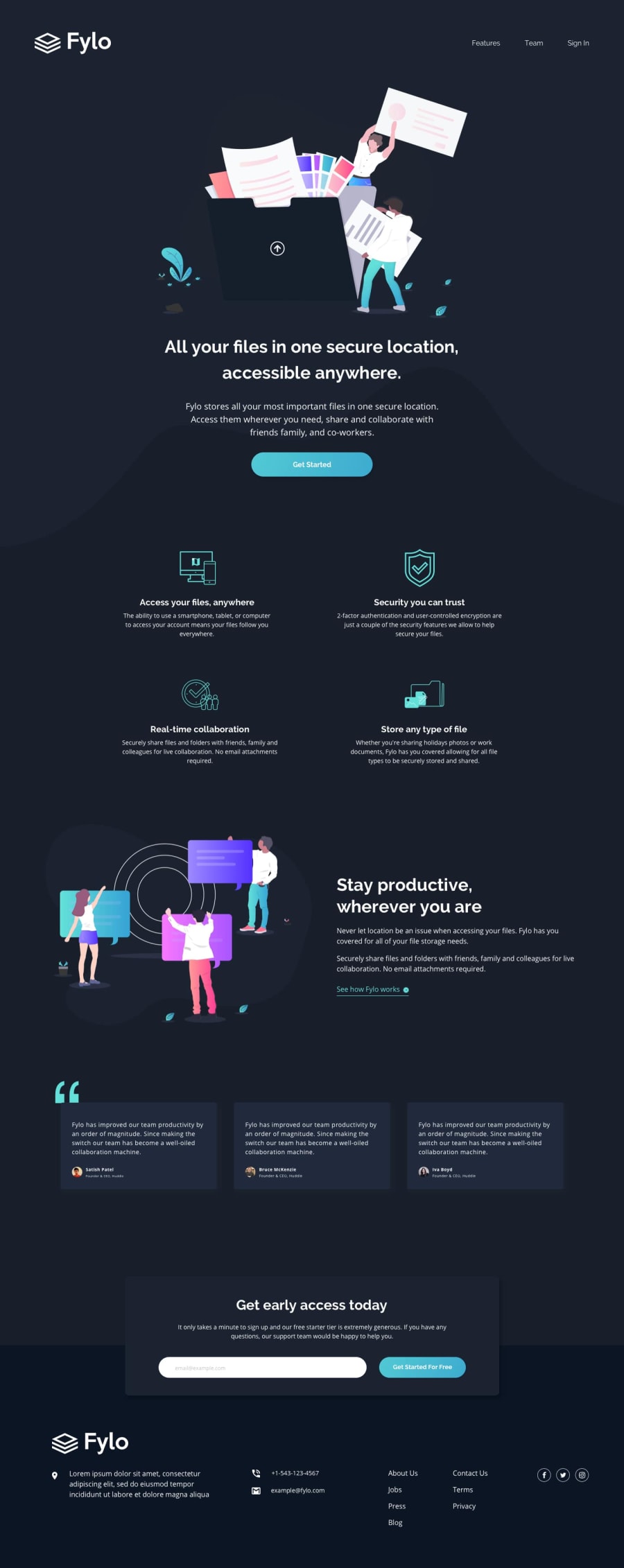
Fylo Landing Page using HTML and CSS


Design comparison
Solution retrospective
This is my First Project on a Landing Page. I used raw CSS for responsive too. So I would be happy to accept all suggestions for my design.
Community feedback
- @ChamuMutezvaPosted over 3 years ago
Here are some other issues to look at:
- since the below code is a list, use an ordered list
<nav class="nav2" >
      <a id="a1" >Features</a>
      <a id="22" >Team</a>
      <a id="a3" >Sign In</a>
    </nav>
something like the below code , to assist with accessibility as well.
<nav class="nav2" > <ul> <li> <a id="a1" >Features</a> </li> <li> <a id="22" >Team</a> </li> <li> <a id="a3" >Sign In</a> </li> </ul> </nav>- Your first heading should be an
h1and the headings should ascend in order without skipping headings (h1, h2, h3 etc)
Marked as helpful0 - @Da-vi-dePosted over 3 years ago
Hi Saibramarambika, the desktop version is good, as first project it's a good result and the challenge is not the easiest. You remind me the first time i did a website, i didn't understand how to appoach responsive web design.
-
Are you familiar with the developer tool? If not, it should become your best friend, once your are in responsive mode set the width at 350 and start working following the given design. I saw your breakpoint at 375px which means that you did everything for desktop and then you tried tho adjust it for mobile, no good! There are lots of resources online about mobile first approach.
-
I encourage you to use different units:
remforfont-sizeandemfor everything else, exceptborderCSS property, wherepxis best suited. -
When you make responsive websites sooner or later you're going to face with positioning issues, so the sooner you practice a lot of
flexboxandgridtechniques the better.floatis still useful and it can comes in handy when you have no other choice but it should be applied to items and not relevant content of the layout, so be careful when you use it.
Hope it helps. Keep coding :-)
Marked as helpful0@SaibramarambikaPosted over 3 years ago@Da-vi-de I am very grateful for your suggestions and feedback. They will really help me a lot in future designs.
1 -
- @afrusselPosted over 3 years ago
Hi, Your work as a first landing page is good. I found problem in responsive view. It's not working on mobile. Please take a look of this. Also check media queries for responsive view.
Marked as helpful0@SaibramarambikaPosted over 3 years ago@afrussel Thanks a lot for your Feedback
1


Please log in to post a comment
Log in with GitHub
Join our Discord community
Join thousands of Frontend Mentor community members taking the challenges, sharing resources, helping each other, and chatting about all things front-end!
Join our Discord