Submitted about 3 years ago
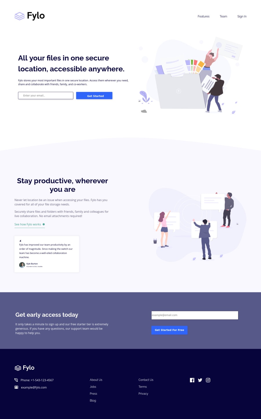
Fylo landing page two column layout - HTML&CSS - using flexbox
@chillcodemao
Design comparison
SolutionDesign
Solution retrospective
What do you guys think is the best way of coding the See how Fylo works
div so that on hover over the div, everything turns to the desired color (text, border and image).
Community feedback
- @tesla-ambassadorPosted about 3 years ago
Hey, This is really great work! I like it. So to answer your question, simply use the CSS pseudocode property (.classname:hover{code}). If you want to add borders and all those other changes, it will work. So, all I can say is;
- For the responsiveness, I think you needed to apply the mobile style at a width around 450px. Cause the rest of the stuff would have fit in other sizes but It still like that it is responsive!
- I noticed that you added some margins to the containers of the other sections like (".about-fylo") and I think it would be better if you put the margins on the content so that you avoid the whitespace at the right and left of those containers.
- To solve the HTML and accessibility issues, I think you should use classes to avoid duplicate ID's. Otherwise, I liked the solution, it is really awesome.
Marked as helpful0
Please log in to post a comment
Log in with GitHubJoin our Discord community
Join thousands of Frontend Mentor community members taking the challenges, sharing resources, helping each other, and chatting about all things front-end!
Join our Discord