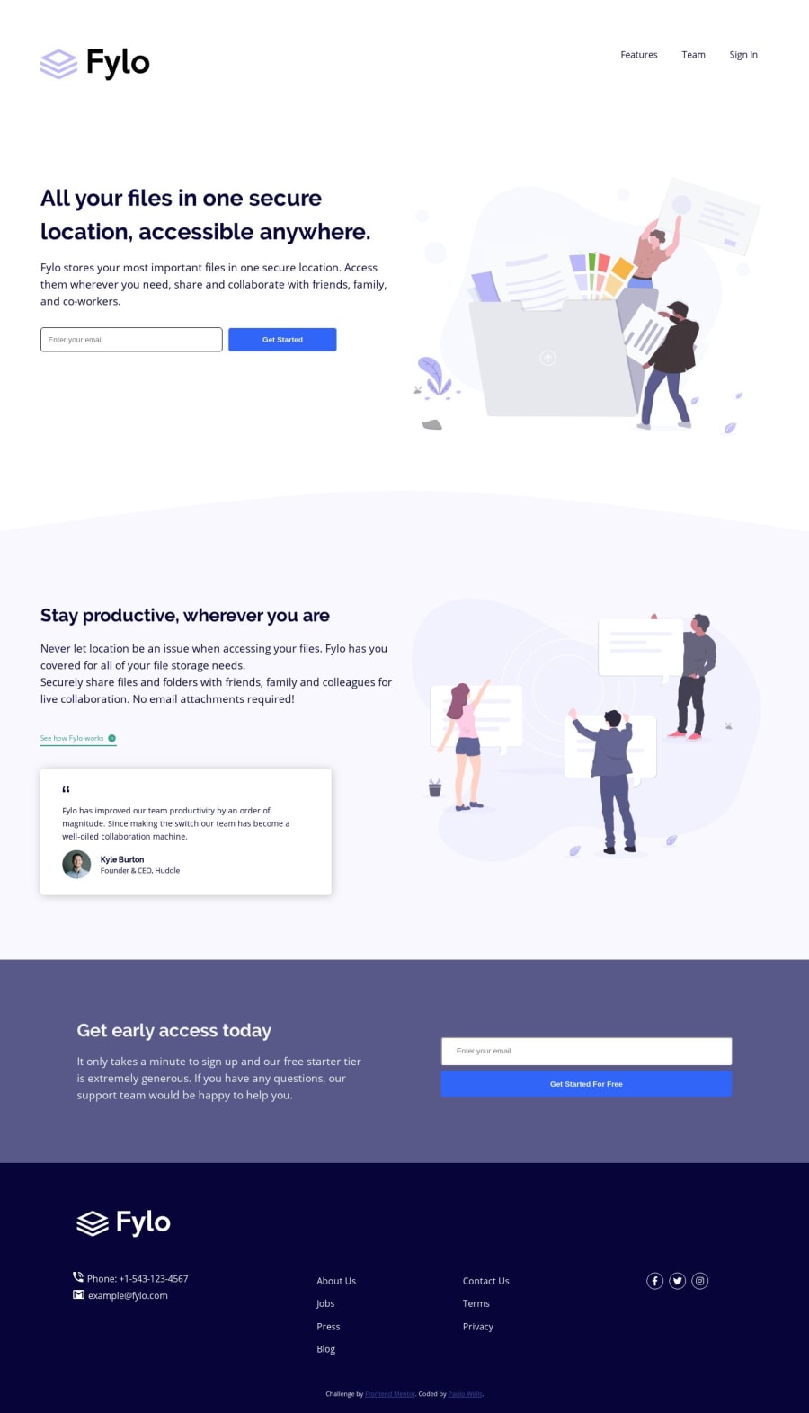
Design comparison
Solution retrospective
Any comments and suggestions are welcome! :)
Community feedback
- @shashiloPosted over 4 years ago
Great job Paulo! The mobile implementation looks really good.
I've worked with many designers and most of them are pixel pushers. Here's a few things I saw that could improve:
-
In the style guide it says to make the desktop a
max-widthof 1440px. Although the way you implemented works, if you wrap your sections in a container it will be easier to maintain. -
A few elements have incorrect width according to the design. The testimonial component, get start for free button, footer icon spacing between icon and text, etc.
2@wellsprPosted over 4 years agoHi @shashilo, thank you very much for your feedback! I really relaxed a little about some widths and spaces and decided to let things a bit different in some places (that's what is meant by pixel pusher here?). I surely intend to revisit the solution in light of your valuable suggestions.
0@shashiloPosted over 4 years ago@wellspr Haha. Yes! If you practice pixel perfection, you receive brownie points from the designer(s). Also, you gain valuable skills to push yourself to become better with CSS.
0 -
Please log in to post a comment
Log in with GitHubJoin our Discord community
Join thousands of Frontend Mentor community members taking the challenges, sharing resources, helping each other, and chatting about all things front-end!
Join our Discord
