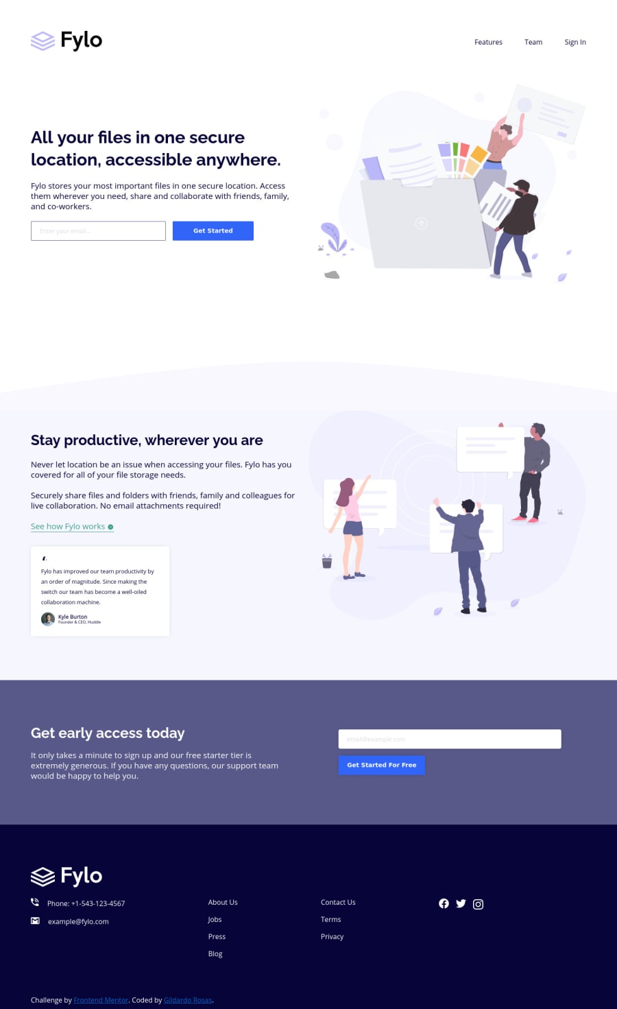
Design comparison
SolutionDesign
Solution retrospective
Hi everyone 👋
I implemented this challenge using a subset or my understanding of BEM and minimal CSS with Grid and Flex when it would make sense. Also I tried to apply semantic HTML.
The spacing and font sizes are a little bit off because I don't use the figma/sketch files 😅.
Any feedback is much appreciated. 🤟
Community feedback
Please log in to post a comment
Log in with GitHubJoin our Discord community
Join thousands of Frontend Mentor community members taking the challenges, sharing resources, helping each other, and chatting about all things front-end!
Join our Discord
