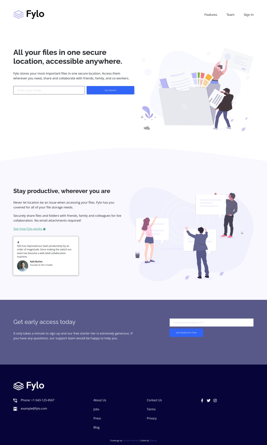
Fylo landing page, responsive mobile first
Design comparison
Solution retrospective
most of the grid is pure css but for the .container class I used the one bootstrap5 has to offer I didn't have access to figma files so the sizing may not be quite accurate. for the icons in the footer: fontawsome didn't have the exact social icons and I couldn't come up with a clean solution for the circle around it, if anyone has a better solution I'll be super greatfull to hear about it.
Community feedback
- @PhoenixDev22Posted over 2 years ago
Hello Zeynab Movasaqpoor,
Congratulation on completing this challenge.
Excellent work! I have some suggestions regarding your solution if you don't mind:
HTML
-
Use the website's name as an alternate text. it may set
alt=”Fylo logo"
. -
You may use semantic element an unordered list
<ul>
to wrap your links within an unordered list structure so that a screen reader will read out how many things are in the list to give visually impaired users the most information possible about the contents of the navigation. -
For the alternate text of the testimonials avatar should not be
Avatar
. It’s meaningless, you can use the avatar namealt=" kyle burton"
. -
Forms with proper inputs and labels are much easier for people to use. To pair the label and input, one way is An explicit label’s
for
attribute value must match its input’sid
value. Input fields without accompanying labels can lead to accessibility issues for those who rely on screen readers. If a screen reader comes across an input field without a label it will try to find some accompanying text to use as the label. (To hide the label visually but present for assistive technology, you may usesr-only
class ) -
look up a bit more about how and when to write alt text on images. Learn the differences with decorative/meaningless images vs important content like
icon-phone, icon-arrow , icon-quotes
andicon-email
are decorative. For decorative images, you set an emptyalt
to it with anaria-hidden=”true”
to remove that element from the accessibility tree. This can improve the experience for assistive technology users by hiding purely decorative images. -
Use the
<nav >
landmark to wrap the footer navigation witharia-label=”secondary “
oraria-label=”footer”
. A brief description of the purpose of the navigation, omitting the term "navigation", as the screen reader will read both the role and the contents of the label. the nav element in the header could use anaria-label="primary"
oraria-label=”main”
attribute on it. The reason for this is that, You should add the aria-label for a nav element if you are using the nav more than once on the page.you can read more in MDN -
Never use
<div>
and<span>
alone to wrap a meaningful content. Just keep in mind that you should usually use semantic HTML in place of the div tag unless none of them (the semantic tags) really match the content to group together. For example , you may use like<address> ...
tag to wrap the contact information for the author/owner of a document or an article (email and phone number). By adding semantic tags to your document, you provide additional information about the document, which aids in communication. -
For the testimonial , you may use
<blockquote>, <figure>, and <figcaption>
. -
You may use the
<address>
tag to wrap the contact information for the author/owner of a document or an article (email and phone number.) -
Adding
rel="noopener"
orrel="noreferrer"
totarget="_blank"
links. When you link to a page on another site usingtarget=”_blank”
attribute , you can expose your site to performance and security issues. -
For the same reason stated before, instead of using a generic
div
with the class.footer__links1
to wrap the links of the<footer>
, you may use an unordered list<ul>
. -
For social links , the svg’s are decorative, so the you should set
aria-hidden=”true”
to be ignored by screen readers and to avoid redundancy and repetition. And the links must have aria-label or sr-only text tells where the link navigates the user. For example:Visit our facebook
.
Overall, great work . Hopefully this feedback helps.
Marked as helpful0 -
Please log in to post a comment
Log in with GitHubJoin our Discord community
Join thousands of Frontend Mentor community members taking the challenges, sharing resources, helping each other, and chatting about all things front-end!
Join our Discord