Design comparison
Solution retrospective
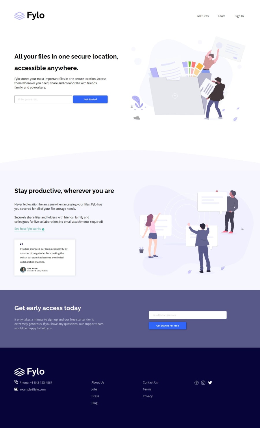
Took some time to adjust everything. I think there are lots of ways to optimize responsive design, but I did some of the things just as it worked properly, not the perfectly optimized-minimal-code-amount solution
Would love to see your reviews and your thoughts on how to shorten the amount of code. Everyone who reviewed my previous tasks can find all their recommendations in this code. Thanks a lot!
btw I'm getting closer to completing all the tasks on HTML/CSS no JS
P.S.: Made a couple of upgrades for a more stylish look, such as images visible overflow, etc.
P.P.S.: Try to adjust each possible size of screen:)
Community feedback
Please log in to post a comment
Log in with GitHubJoin our Discord community
Join thousands of Frontend Mentor community members taking the challenges, sharing resources, helping each other, and chatting about all things front-end!
Join our Discord
