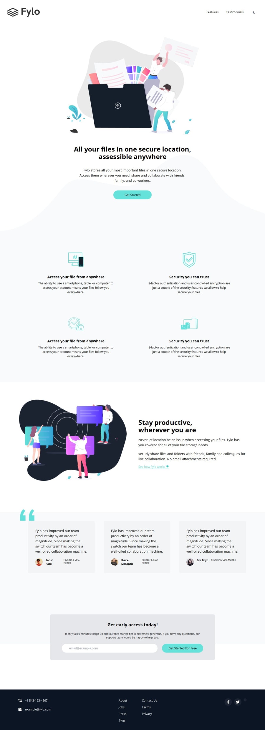
Fylo Landing Page [HTML, CSS, SASS, Flexbox, CSS Grid]
Design comparison
Solution retrospective
📕Any feedback is welcome and appreciated!
Community feedback
- @mukwende2000Posted almost 2 years ago
Wow i love everything about this solution, it looks really pretty and neat i must also that your css structure is great, writting the media querries right next to the corresponding styles is a great idea, to make it even more easier, i would split the in different styles into their own files so that each file contains styles for a certain section. I would also encourage you to approach styling mobile first for responsiveness since websites are responsive by default without any css, it makes it easier to start with mobile rather than writing for desktop and overriding those styles with mobile ones. For example see how you wrote
.hero {
  display: flex;
  align-items: center;
  justify-content: space-between;
}
@media only screen and (max-width: 47.5em) {
  .hero {
    flex-direction: column;
    justify-content: center;
    align-items: center;
    text-align: center;
  }
}
writing mobile first would reduce the code to just
@media only screen and (min-width: 47.5em) {
  .hero {
    display: flex
    justify-content: space-between;
    align-items: center;
  }
}
The site is already aligned in the column when you write without any css, so there is really no need of making it flex and aligning it in a row and then bringing it back to a column which it was in the first place.
Like i said this is really clean both the site and the code...
0
Please log in to post a comment
Log in with GitHubJoin our Discord community
Join thousands of Frontend Mentor community members taking the challenges, sharing resources, helping each other, and chatting about all things front-end!
Join our Discord
