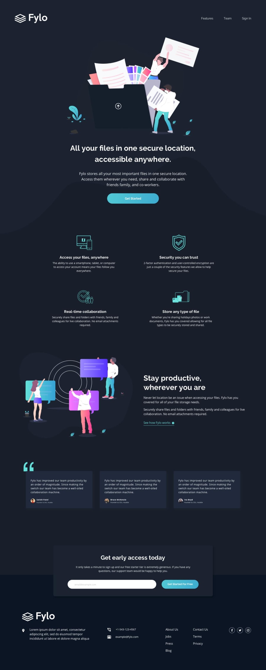
Design comparison
Solution retrospective
Feedback is appreciated!
Community feedback
- @JonKohJJPosted over 3 years ago
Hi Pikamart! Thanks for the feedback. I have done the necessary changes but I still needed to cut a few corners. Regarding the 'width: 100vw' attribute on my 'filler' div, may I know what phone you are using? I am not able to horizontally scroll on my iphone 8 plus.
0 - @pikapikamartPosted over 3 years ago
Hey, great work on this one. Though I zoomed out because layout is for mobile, are you using large screen? Though the layout is good both in desktop and mobile.
Some suggestions would be:
-
On the navbar links also in the footer links, you are transitioning the
font-weightright, this makes a shake and pushes other elements. Instead what you can do, is transitiontext-shadowgiving an effect that the text are getting bolder by adding it to the text. This way, it won't create that pushing effect. -
Adjusting your breakpoints, I saw that you added 1440 something as a tablet size. There are lot of users, like me, using 1366x768 monitor/laptop. So I will always get that tablet size and need to zoom out. Maybe considering lowering it down would be a great idea.
-
Your "see how fylo works" should have been wrapped inside
atag, since it is supposed to be a link. -
Your email
inputas well as thebuttonnext to it should have been inside aformtag. Also add anameproperty on the input, this is the targeting property whenever other developer who is on backend will use to get the data need from the form. -
On the mobile view, there is a horizontal scroll. To fix this, remove the
width: 100vwon thefillerselector inside yourhero-containerselector.
Aside from those, really good job^
0 -
Please log in to post a comment
Log in with GitHubJoin our Discord community
Join thousands of Frontend Mentor community members taking the challenges, sharing resources, helping each other, and chatting about all things front-end!
Join our Discord
