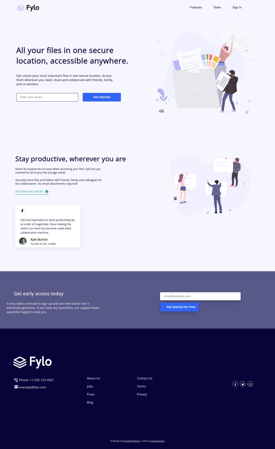
Design comparison
Solution retrospective
I appreciate the feedback <3
Community feedback
- @vanzasetiaPosted over 2 years ago
Hi, Guido! 👋
Congratulations on completing this challenge! 🎉
I recommend doing the easier challenge (e.g. the component challenges) first because in my opinion this is not what I expect and there are a lot of issues. So, my recommendation is to do small challenges first to build up your skill first and then refactor this one after you've gained more experience and possibly some feedback.
However, I going to tell you what you can do to improve this solution (can be applied to other challenges as well).
- The logo is one of the most important contents of this site. It's a way for search engine bot and screen reader users to know what the site or project is called. So, I recommend using the company name as the alternative text for it.
- Don't use
br
to move the text to another line so that it looks similar to the design. Let the text break where it should. It also will be read out by screen readers. You can't accommodate every screen size, so it's rare you'll ever need to use them. So, my recommendation is to usemax-width
instead. - Don't use
br
for spacing. Use CSS instead. - Always use classes to reference all the elements that you want to style. Using
id
is going to make your stylesheet have high specificity (hard to maintain). - No inline styling! Put all the styling in your CSS. This way, it is reusable and can be easily maintained.
- Use
button
withtype="submit"
instead of submit input. It's a browser legacy. label
element is used for the input element. So, make sure everyinput
has a label and remove anylabel
that has nothing to do with theinput
.
This might be a lot for you so, apply one feedback at a time and improve little by little.
That's it! I hope this information is useful! 😁
1@GuidiUZPosted over 2 years ago@vanzasetia Thanks for your recommendations. What is most difficult for me is the spacing of the texts, so the options that you are giving me are good. Thanks again and I'll try to implement everything little by little.
0
Please log in to post a comment
Log in with GitHubJoin our Discord community
Join thousands of Frontend Mentor community members taking the challenges, sharing resources, helping each other, and chatting about all things front-end!
Join our Discord