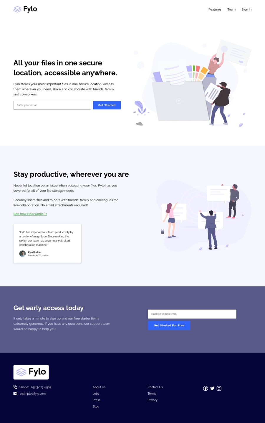
Fylo landing page challenge (Responsive (; )
Design comparison
Solution retrospective
Hello world!! Any suggestions for improvements!!! Thank you (:
Please log in to post a comment
Log in with GitHubCommunity feedback
- P@brodiewebdt
The layout on this looks great. There are a couple of things that need to be fixed. You have two H1 tags. You only want to use one on a page. Make the Stay productive text an H2 and style it the same as the H1. You don't need to wrap the buttons in an A tag. Remove the a tags and give the buttons a type of Submit. Any form buttons should have a type of Submit as they are set up to submit the form when filled out. The other thing is you don't have any form validation. That is something will have to do with some of the more involved layouts.
Hope this helps.
Marked as helpful - @codezeloss
Oh thank you so much David!! Great annotations & suggestions, not just to edit my code but also to improve my skills and the way I'm writing and structuring the code. Thanks again, you're comments are always so helpful.
Join our Discord community
Join thousands of Frontend Mentor community members taking the challenges, sharing resources, helping each other, and chatting about all things front-end!
Join our Discord
