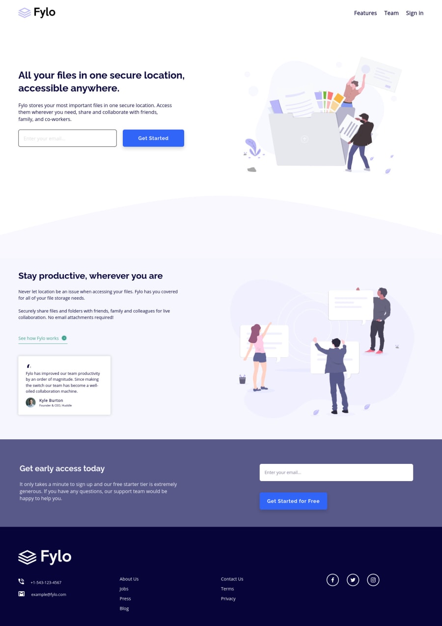
Design comparison
SolutionDesign
Solution retrospective
So much time without doing these challenges Any feedback is welcome :D
Community feedback
- @ApplePieGiraffePosted over 3 years ago
Hey, Aaron Gonzalez! 👋
Yes, it has been a little while since you submitted a solution—good to see you again! This one's looking pretty nice! 👍
I few things I'd like to suggest are,
- Making sure there's always a little bit of room between the content of the page and the sides of the screen (the two are right up against each other at certain screen sizes).
- Adding
overflow-x: hiddento thebodyor something similar to prevent a horizontal scroll bar from appearing along the bottom of the page in the desktop layout. - Turning the social media icons in the footer of the page into links using the anchor tag.
Hope those tips help. 😉
Of course—keep coding (and happy coding, too)! 😀
0 - @palgrammingPosted over 3 years ago
you should add the hover color change on the links and social icons in the footer you also should work on making the email validation error look more like the design images
0
Please log in to post a comment
Log in with GitHubJoin our Discord community
Join thousands of Frontend Mentor community members taking the challenges, sharing resources, helping each other, and chatting about all things front-end!
Join our Discord
